Carbon & Cloud
Sustainability tracking app
- Context
- University coursework
- Role
- UX/UI Design
- Timeline
- 3 months · 2024
- Team
- 4 people
- Tools
- Figma, Miro
The problem
Everyday smartphone use burns real energy and produces real emissions, but it's completely invisible to the person doing it, so nothing changes.
My role
One of four designers on a coursework team. I contributed across user research, information architecture, wireframing, high-fidelity design and the style guide.
The outcome
A designed app concept that turns three measurable inputs, data transmission, device power and cloud usage, into a personal footprint, with gamification built to sustain engagement past the first week.
Background
The footprint nobody sees.
Digital technology is growing fast, and everyday smartphone use contributes significantly to energy consumption and carbon emissions. Almost nobody using a phone is aware of it.
Carbon & Cloud explored how a mobile application could raise awareness of the environmental footprint of digital activity, and encourage more sustainable behaviour.
The aim was to make invisible energy use visible: track mobile usage in real time, translate it into clear feedback on energy consumption and CO₂, and close the gap between a personal habit and its environmental consequence.
Competitive analysis
Two apps, two different ways of missing.
Existing apps revealed a consistent gap: the ones with accurate personalised tracking weren't engaging, and the engaging ones weren't accurate.
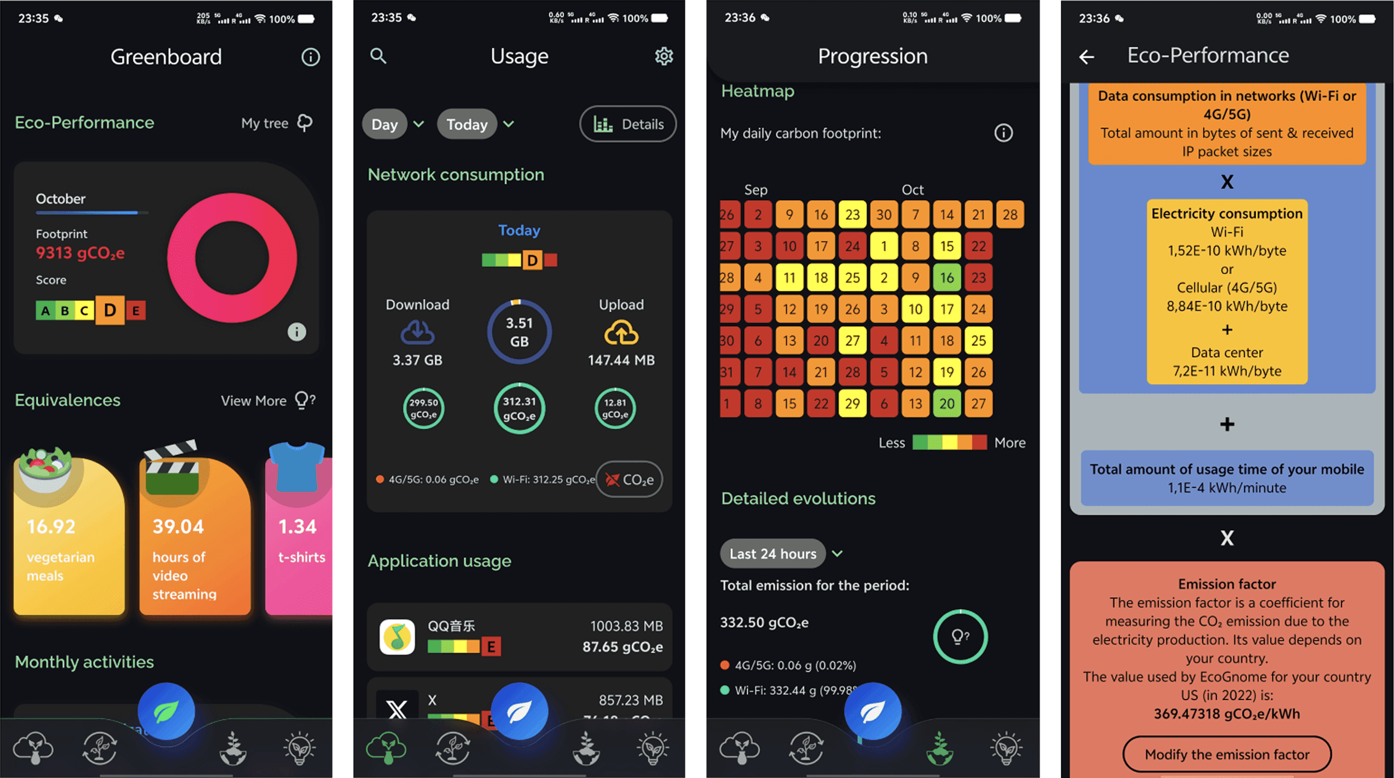
EcoGnome
Monitors mobile data and power consumption, but runs into its own paradox, you have to use the phone to track the phone, which adds to the emissions you're trying to reduce. Less usage means less CO₂.
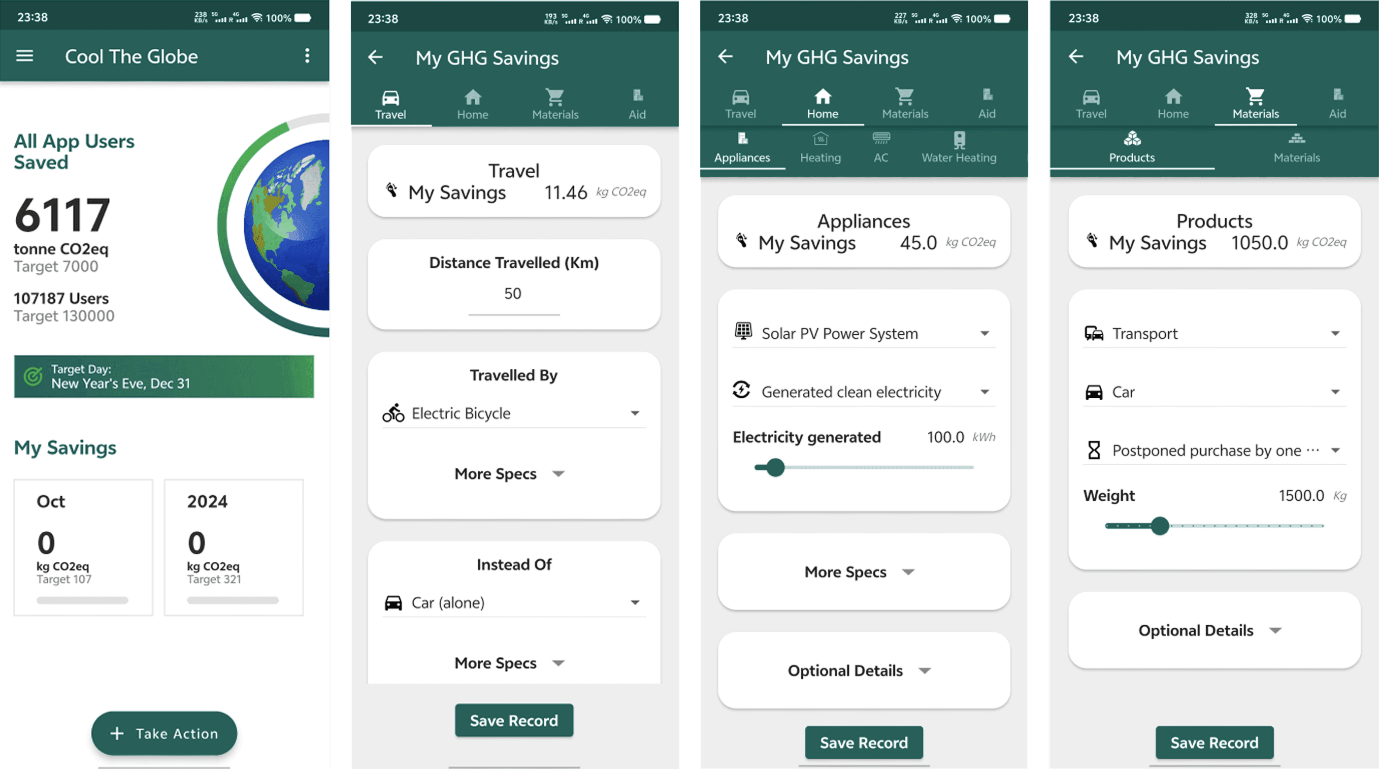
Cool the Earth
Estimates emissions from national averages and manual input. That reduces precision, and manual entry kills engagement fast, the user has to set a goal and take every action themselves.
User study
People don't think their phone is their problem.
The user study surfaced two findings that shaped everything after it. First, most participants overlooked their mobile carbon emissions entirely, treating it as a corporate issue rather than an individual one. Second, almost everyone engaged in digital hoarding, rarely uninstalling unused apps, rarely managing cloud storage.
Together those two findings meant awareness alone wouldn't be enough. The app would need to show people their own number, then give them something concrete to do about it.
Information architecture
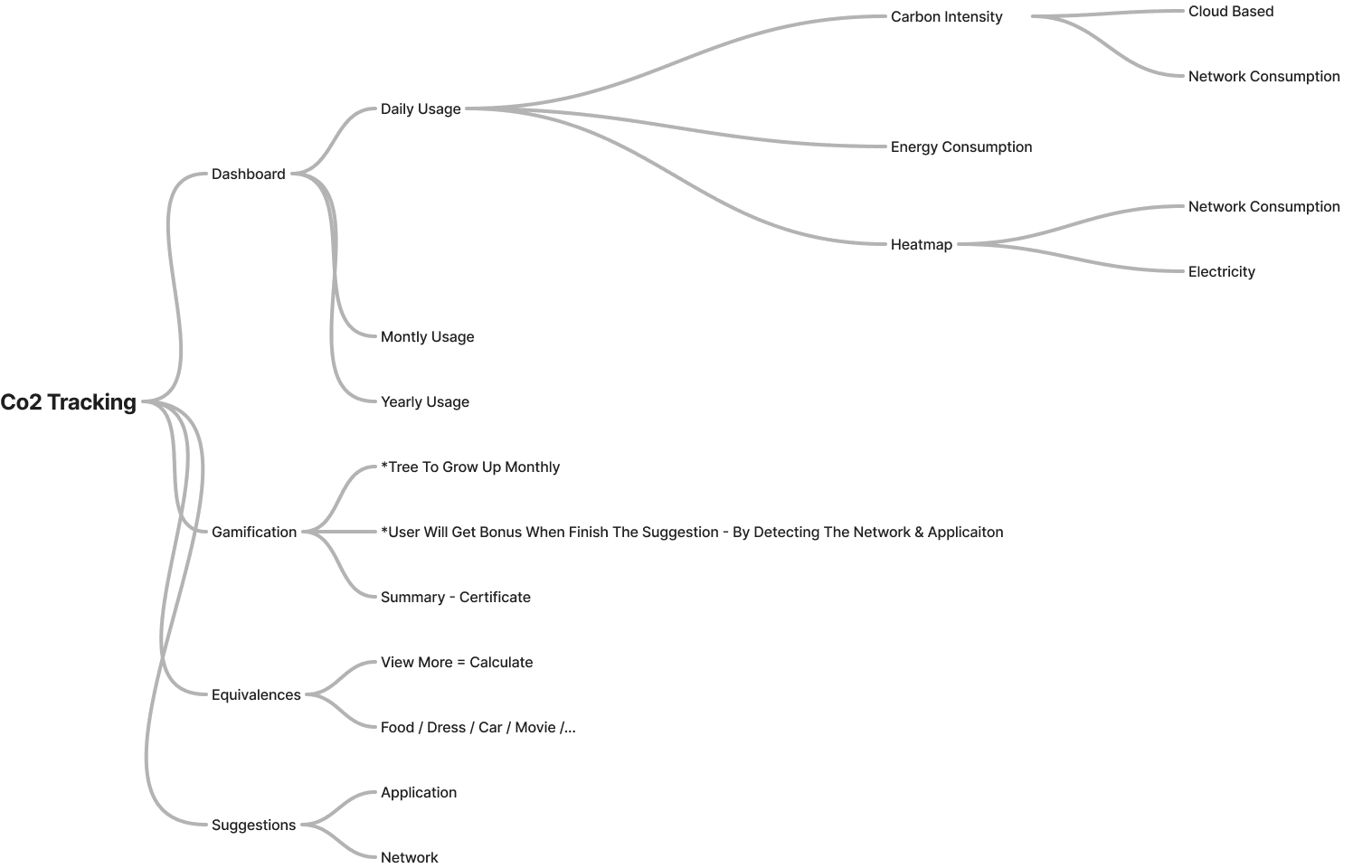
Simple navigation, because the subject is already complicated.
The IA was built around getting a user from 'I have no idea' to 'here is my number and here is one thing I can do' in as few steps as possible.
Low-fidelity wireframing
Shaped directly by what the user study found.
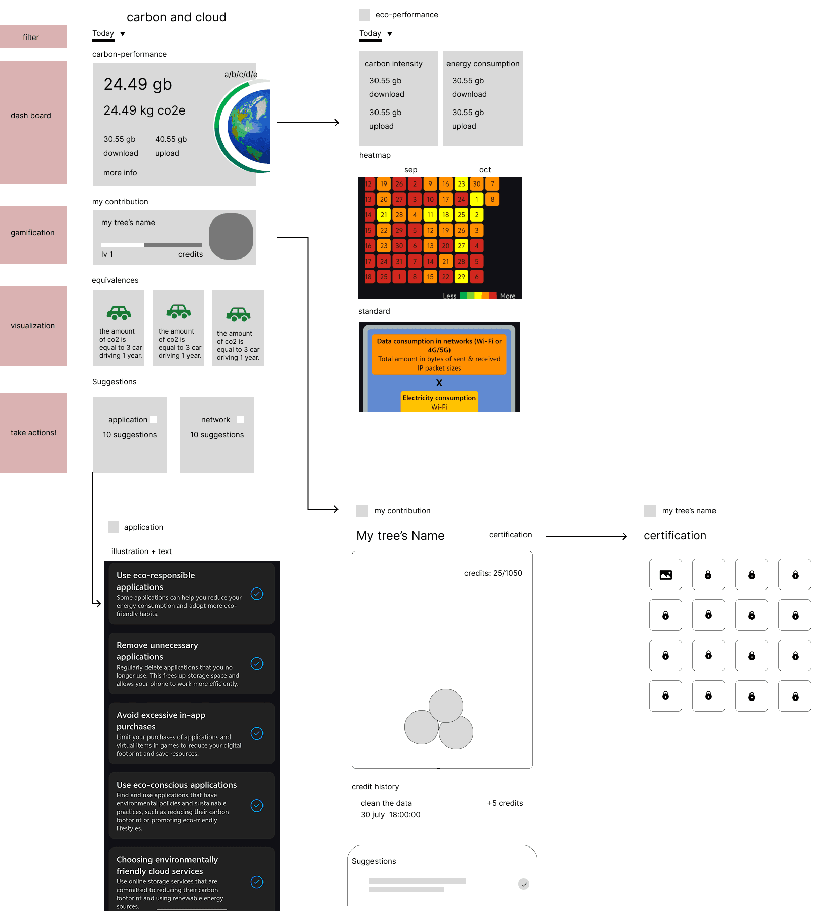
The wireframes emphasised simple navigation and prioritised the features that addressed users' lack of awareness about their own mobile carbon emissions, the dashboard, the equivalences, the suggestions and the tree.
Hi-fi design — home page
Making a number feel like something.
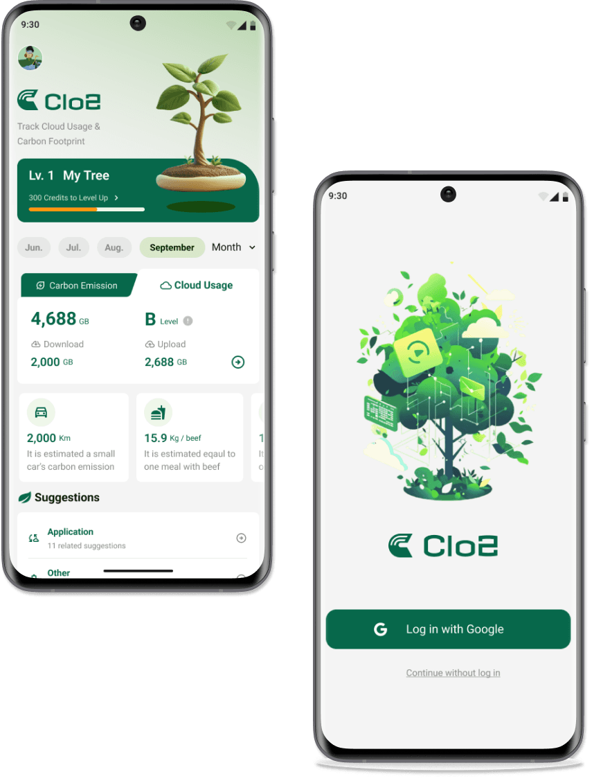
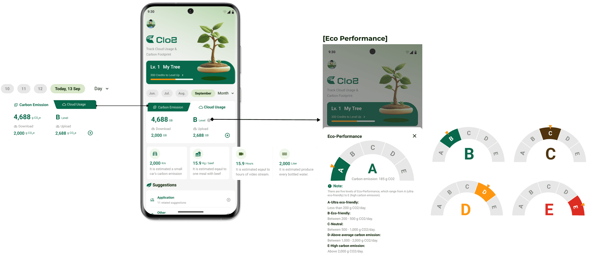
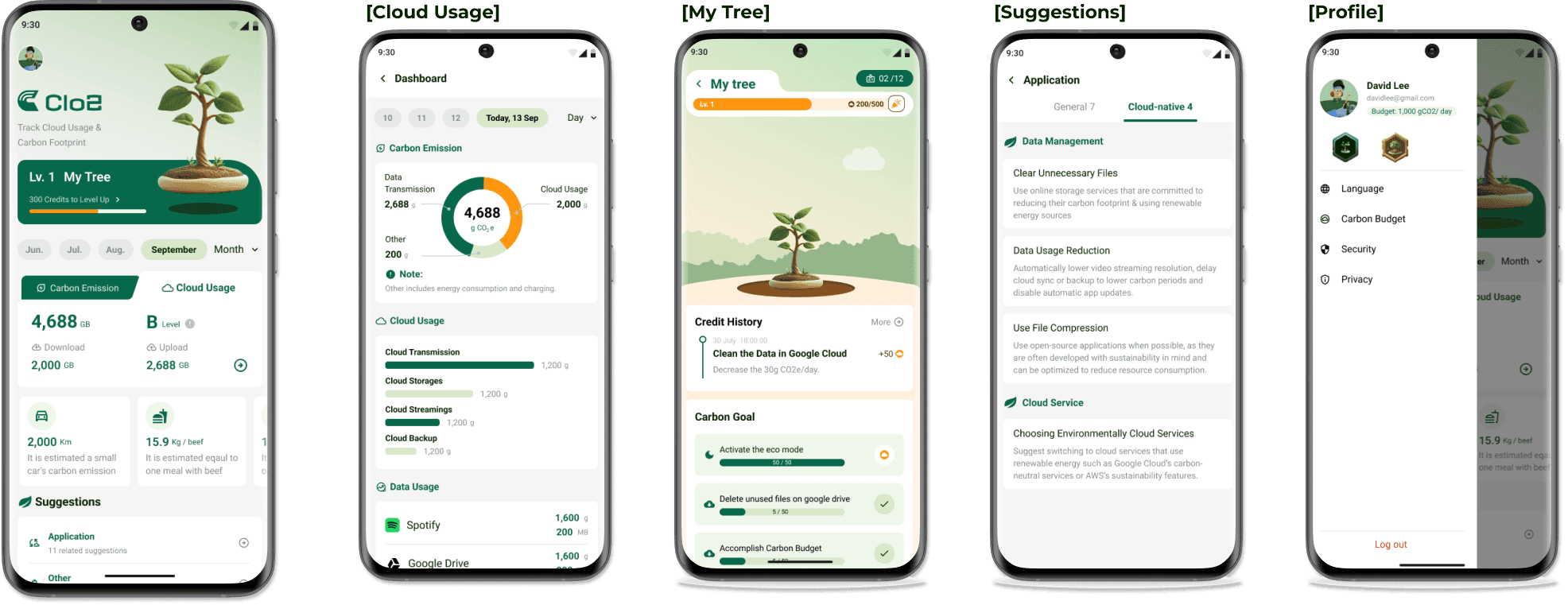
The home screen leads with the tree and the month's figures, then breaks the total into carbon emission and cloud usage. Tapping the eco-performance level opens a five-band scale, A for under 200g CO₂/day through to E for over 2,000g, so a letter grade always has a number behind it.
Design strategy
Two decisions that everything else follows from.
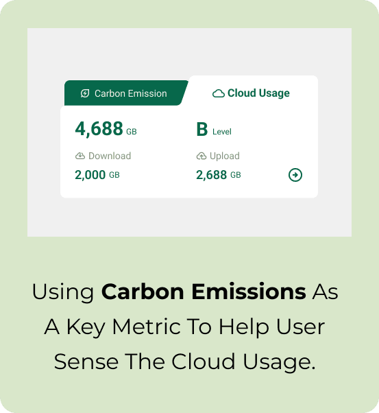
Carbon emissions as the key metric
Gigabytes are a storage concept, not an environmental one. Leading with CO₂ gives the user a way to sense what their cloud usage actually costs.
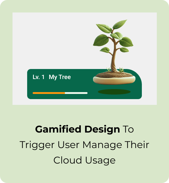
Gamified design as the trigger
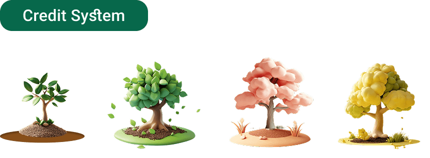
Awareness fades. A growing tree, credits and badges give the user a reason to come back after the novelty of the first number wears off.
Hi-fi design — overview
Five screens, one system.
Beyond the home screen: the dashboard breaks emissions down by transmission, storage, streaming and backup; My Tree holds the gamification layer; Suggestions groups concrete actions by data management and cloud service; and Profile carries the carbon budget, language, security and privacy settings.
Gamification
Giving a slow, invisible payoff a visible one.
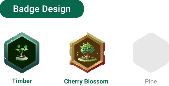
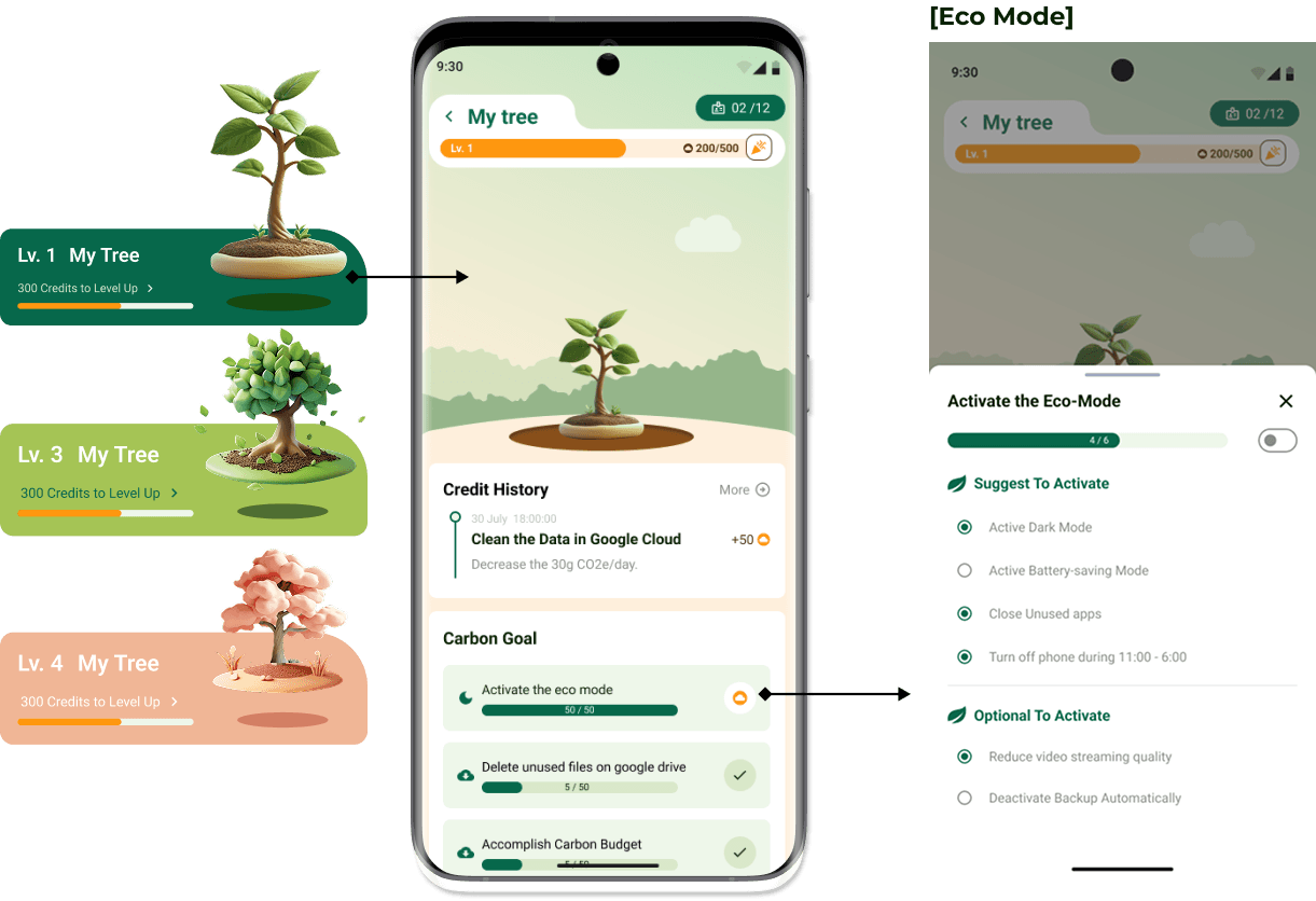
Users earn credits for actions that genuinely reduce emissions, clearing unused cloud files, activating eco mode, staying inside a carbon budget. Credits grow a virtual tree through levels, and badges mark the milestones.
Data carbon
How the number is actually calculated.
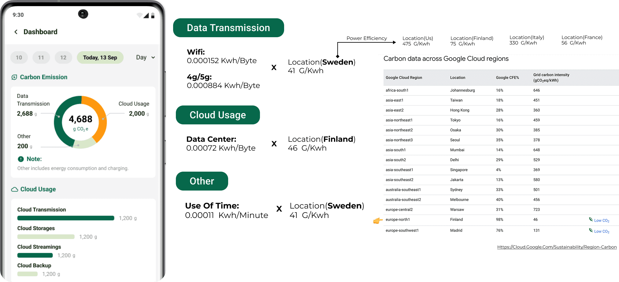
Emissions come from three measured inputs, each multiplied by the grid carbon intensity of the relevant location. Data transmission is charged at 0.000152 kWh/byte over Wi-Fi and 0.000884 over 4G/5G. Cloud usage runs at 0.00072 kWh/byte against the data centre's region. Device time adds 0.00011 kWh/minute.
Location matters enormously: the same activity produces 46 gCO₂/kWh in Finland and 648 in Mumbai. Pulling real per-region figures from Google Cloud is what makes the footprint individual rather than a national average, the precision problem both competitor apps had.
Design style guide
One visual system for a four-person team.
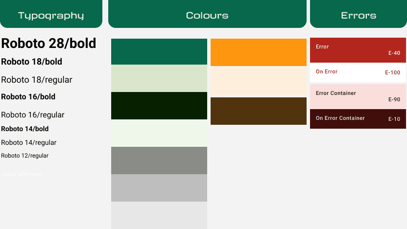
Roboto across seven type sizes, a green-led palette with an amber accent for progress, and a dedicated error set, so four people designing in parallel produced screens that looked like one app.
Outcome
What it delivered
Precision instead of averages
Building the calculation from data transmission, device power and cloud usage against real per-region grid intensity, rather than national averages, directly addressed the accuracy problem both competitor apps had.
Awareness designed to survive week two
The user study showed people treat emissions as somebody else's problem. Credits, badges and a growing tree were the mechanism for keeping engagement alive after the novelty of the first number wears off.
Abstract numbers made physical
Equivalences, kilometres driven, meals with beef, hours of video, turn a gram figure into something a person can actually picture.
A complete visual system
Delivered with a full style guide covering typography, colour and error states, so the four-person team stayed consistent across the whole app.
Reflection
What I learned, and what I'd change
The most interesting constraint was EcoGnome's paradox: a tracking app costs energy to run. It reframed the design goal from 'show as much data as possible' to 'get the user to insight in as few sessions as possible', the opposite of what an engagement-driven app usually optimises for.
What I'd change: we validated the concept but never tested whether the gamification actually changed behaviour over time. A multi-week diary study would be the honest next step, a growing tree is a satisfying idea, and satisfying ideas are exactly the ones worth testing hardest.