SwipeJobb Business Panel
Recruiter dashboard redesign
- Company
- rNWIST
- Role
- UX/UI Design
- Timeline
- 2026, ongoing
- Scope
- 20+ screens, end-to-end
- Tools
- Figma
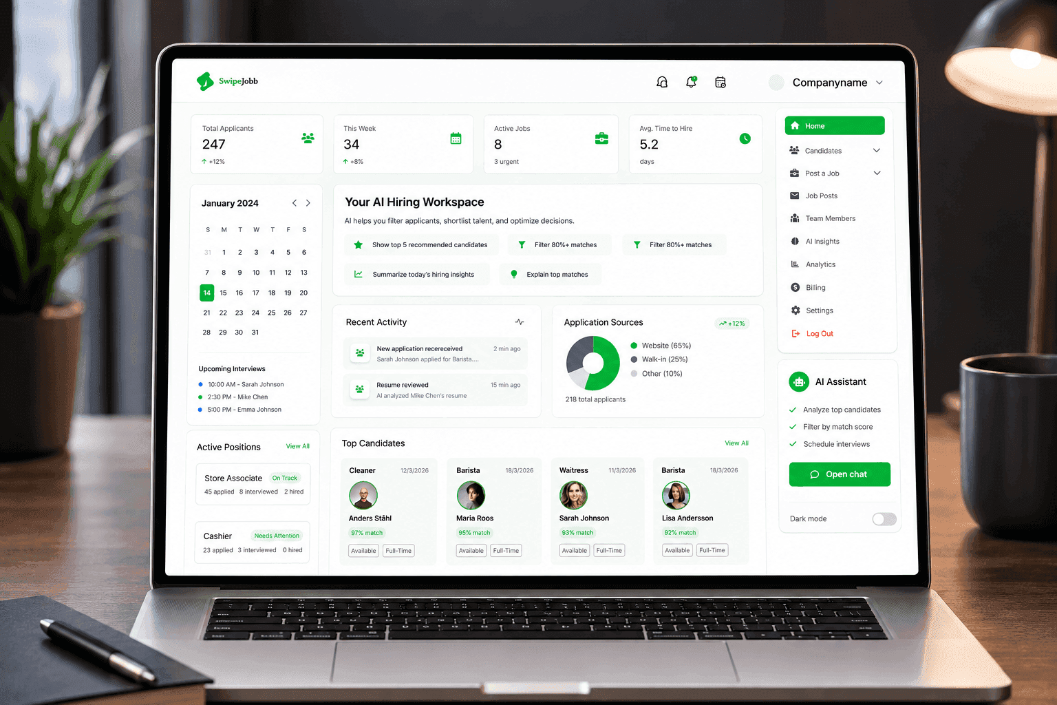
The problem
The panel had been built by developers with no designer involved, so the interface was the problem as much as the structure. Type, colour and spacing were decided screen by screen, icons were pasted in as images at different weights, and nothing sat on a shared grid. Underneath that, the navigation didn't match how recruiters actually work.
My role
I redesigned the recruiter panel end to end: auditing the existing build, defining a design system and a full UI language from the product's brand colours, restructuring the navigation around how recruiters actually work, and designing 20+ high-fidelity screens with a connected prototype for developer handoff. I also led a UX intern through the prototype work, assigning tasks, reviewing progress, building the component list, designing the master components and running review-and-refine cycles.
The outcome
A consistent interface built on a real design system, a navigation structure that follows the recruiter's workflow, and a connected prototype covering the core flows, ready for testing and dev handoff.
The problem, and the solution
A UI built without a designer, on top of a structure that didn't match the work.
The panel had been built by developers with no designer on it. Recruiters were looking at an interface where every screen had been solved on its own, and navigating a structure that had no system underneath it.
The problem
No visual language
Type sizes, colours and spacing were chosen per screen, so the same element looked different depending on where you found it.
No design system
Colours, spacing and components were decided screen by screen, with nothing defined once and reused.
Icons as raster images
Dropped in as pasted images, so weight and style varied page to page and none of them scaled cleanly.
No shared layout grid
Cards, tables and pipeline columns drifted out of alignment with each other.
A flat sidebar
Every feature listed at the same level, with no grouping recruiters could follow.
No clickable prototype
Nothing to test with recruiters, and nothing to hand off to developers.
The solution
A consistent UI language
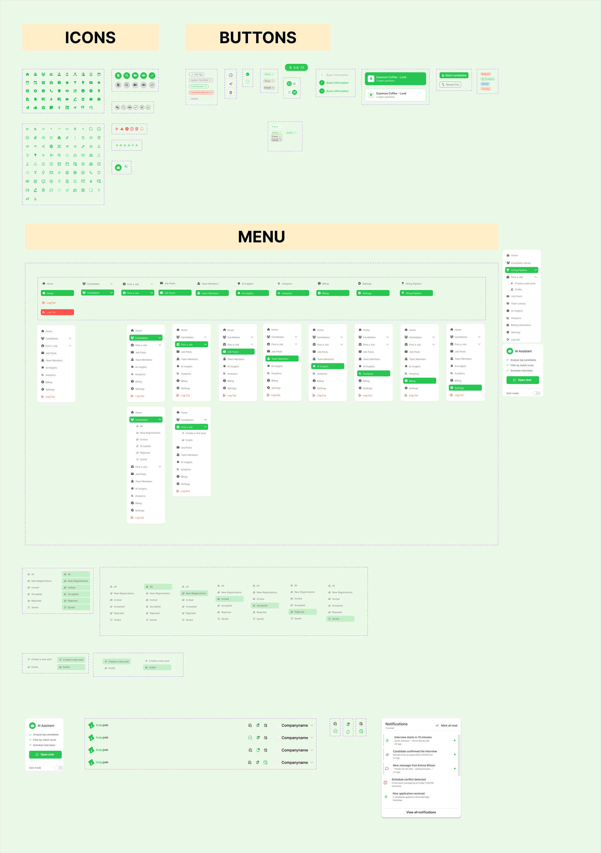
One type scale, one colour set and one spacing rhythm, so a button, a card or a table row looks the same wherever it appears.
A design system
Colour, type, spacing and components defined once, reused everywhere.
One SVG icon library
Replacing the old mix of pasted images with a single consistent set that scales.
A shared layout grid
So every screen holds the same alignment and rhythm.
Navigation around the workflow
Restructured to follow what recruiters actually do: post, review, interview, hire, manage.
A connected prototype
Covering the core recruiter flows, ready for testing and dev handoff.
Overview
From auditing the existing build to delivering a connected, dev-ready prototype.
- 01
Audit
Screen by screen through the existing panel
- 02
System
Tokens, type, spacing and an SVG icon library
- 03
Design
20+ high-fidelity screens on the new system
- 04
Navigation
Merging duplicate menus, renaming by purpose
- 05
Prototype
Connected flows for testing and handoff
Audit
Mapping what was actually broken.
Before redesigning anything, I went through the existing panel screen by screen: dashboard, hiring pipeline, job posts, team members, billing, analytics, calendar and messaging. The goal was to catalogue exactly where colour, spacing, icons and layout broke from each other, so the work started from a concrete list rather than a general sense that it needed work.
System
Building the design system, and the visual language on top of it.
Starting from the product's existing brand colours, I built out a full token set: colour, typography, a spacing scale, and an SVG icon library. Every screen from that point forward drew from the same source instead of being solved individually, which is what turned the panel from a collection of screens into one interface.
Colour tokens
Four values, derived from the product's existing brand green, covering every state the panel needed.
#29C551
Primary
Actions, active states, success
#292D32
Ink
Body text, headings, icons
#747474
Muted
Secondary text, inactive states
#E4E4E4
Surface
Dividers, table rows, disabled
Design
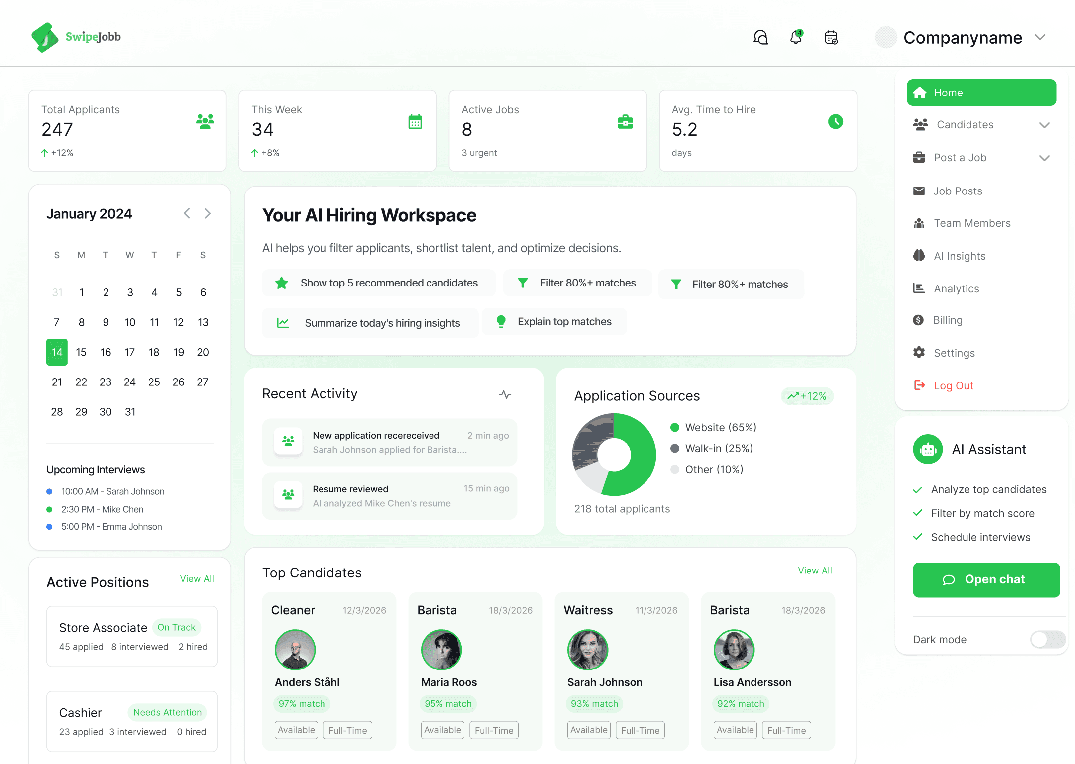
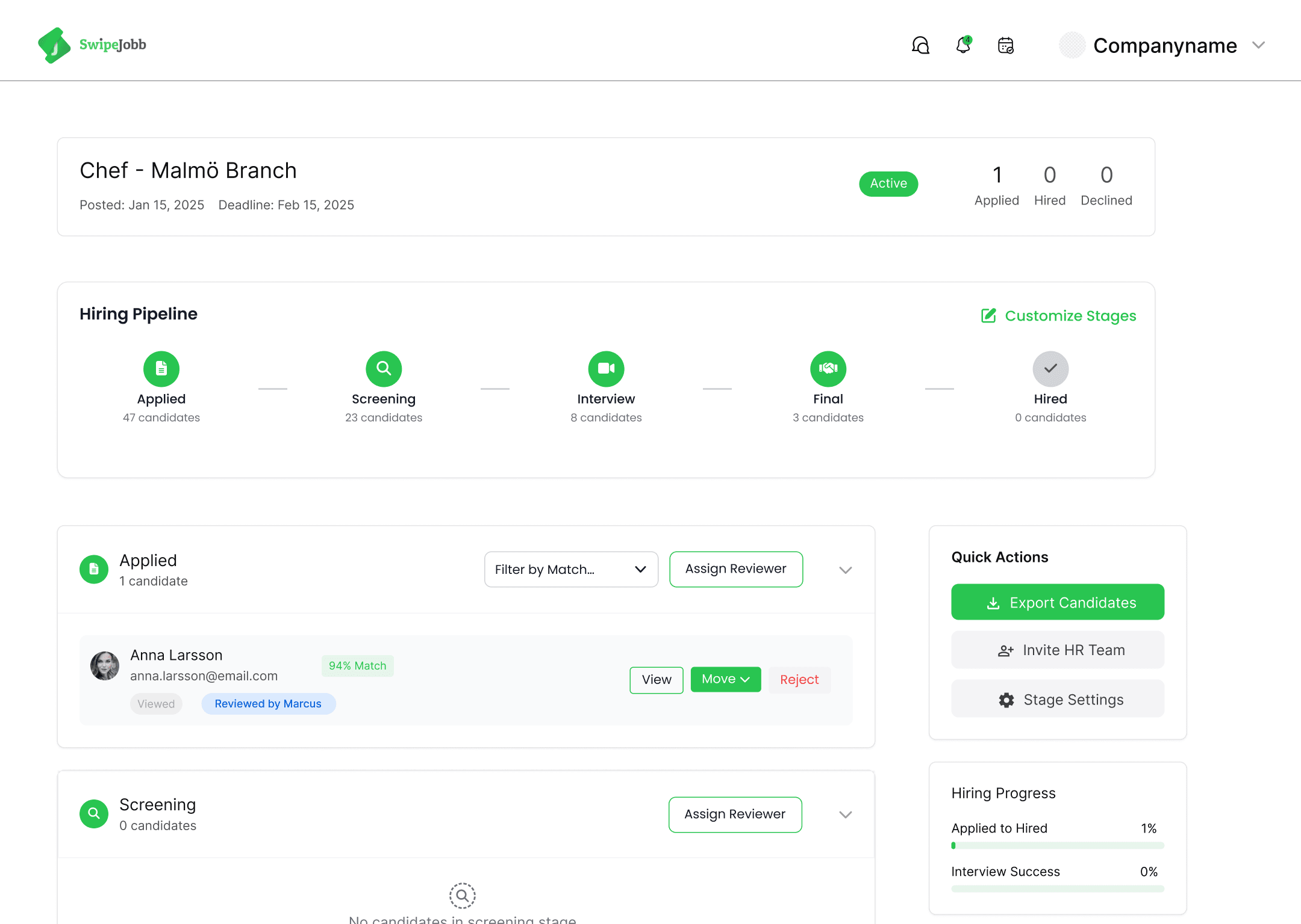
20+ high-fidelity screens.
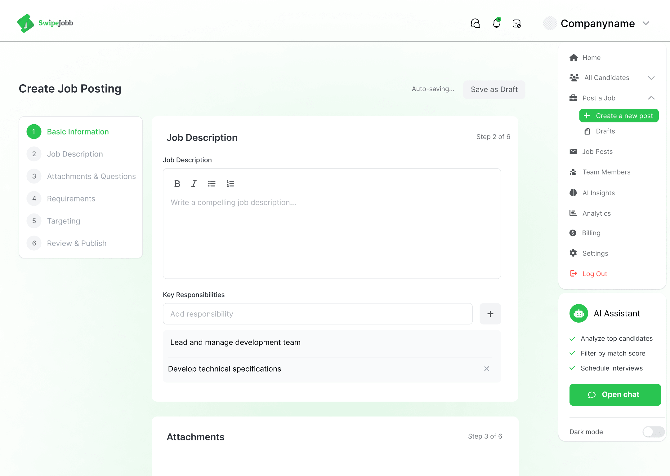
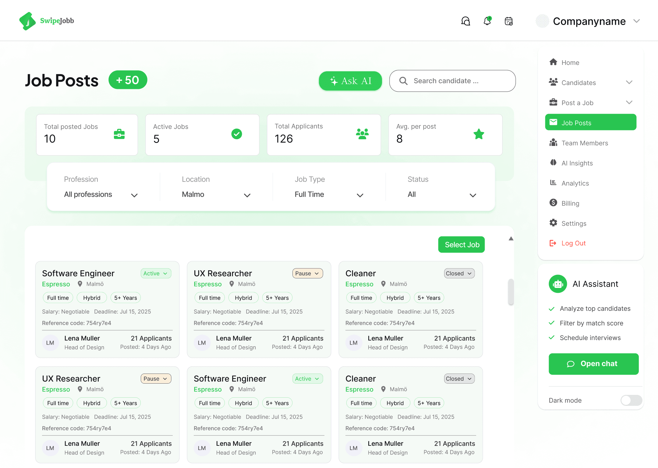
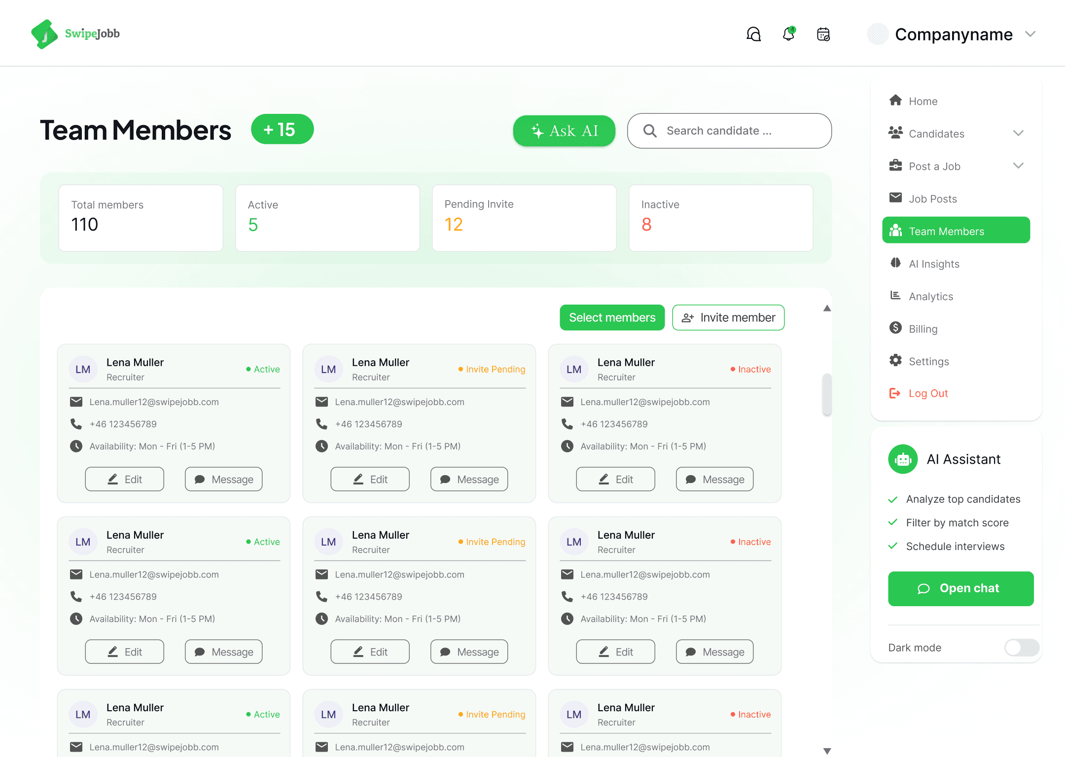
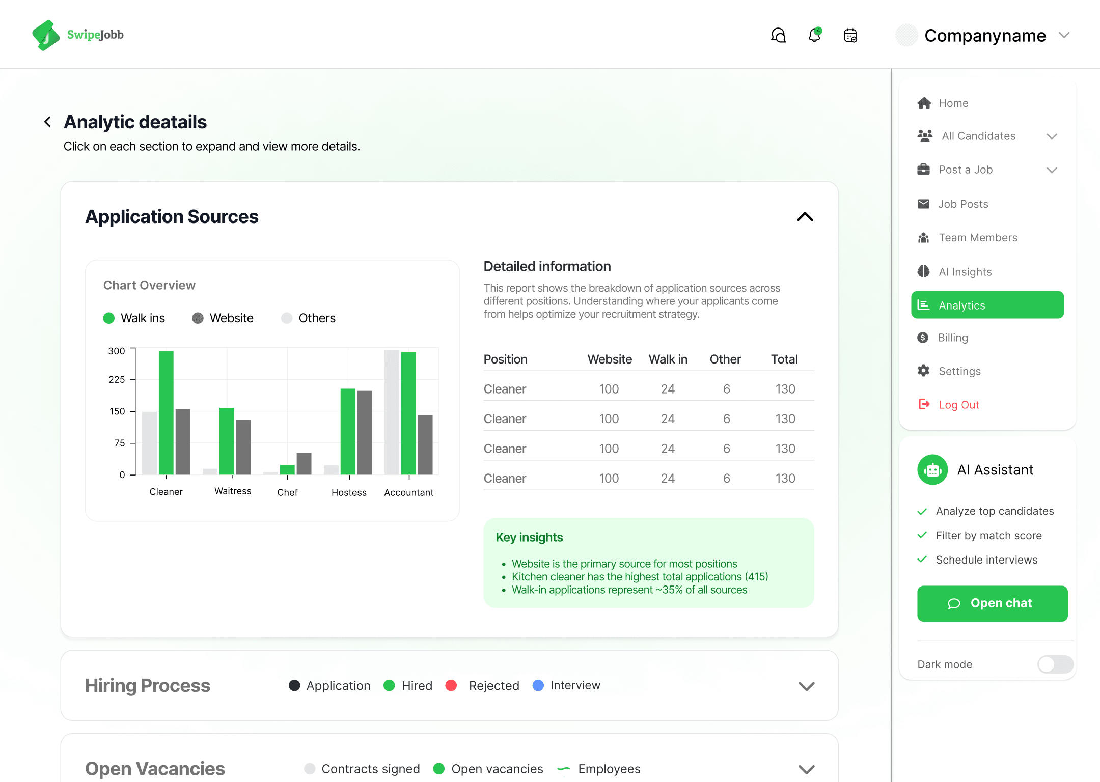
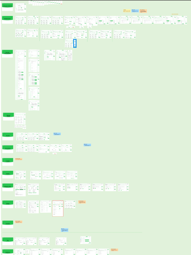
I redesigned every core area of the panel on the new system: hiring pipeline, job posts and the job creation flow, team members, billing, analytics, interview calendar, notifications and messaging. The old, unaligned versions were replaced with screens built on a shared grid.
Navigation
Merging duplicate menus, naming things by what they do.
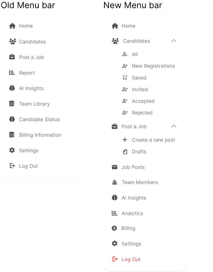
The old sidebar listed 'Candidates' and 'Candidate Status' as two separate items. Both pointed at the same information. A recruiter had to check two different places to see where someone stood in the process, and it wasn't clear which one was current.
'Post a Job' got the same treatment, split into 'Create a new post' and 'Drafts', so starting something new and picking up an unfinished one are two distinct actions instead of one crowded link.
Two labels changed for the same reason. 'Team Library' became 'Team Members', because the section holds people, not a library. 'Report' became 'Analytics', which is what recruiters were actually looking for when they clicked it. Small changes, but the old names described how the system stored things, not what the recruiter came to do.
Prototype
A connected, dev-ready prototype.
The 20+ screens were connected into an interactive prototype covering the core recruiter flows, from posting a job through to reviewing and hiring a candidate. That gave the team something clickable to review, and developers a clear spec to build against instead of designing directly on live code.
Outcome
What it delivered
A UI that finally looks like one product
One type scale, one colour set and one spacing rhythm replacing decisions that had been made screen by screen, so the same element now looks the same wherever a recruiter finds it.
A system where there wasn't one
Colour, type, spacing and components defined once and reused, plus an SVG icon library replacing the old pasted images.
Navigation built around the recruiter's day
Duplicate menus merged, labels renamed to describe the task rather than the storage, and the sidebar ordered by how the work actually flows.
20+ screens on one grid
Every core area redesigned on the shared system, replacing versions that had drifted out of alignment with each other.
Something to test and something to build from
A connected prototype covering the core flows, giving the team a clickable review and developers a clear spec.
Reflection
What I learned, and what I'd change
The audit was the part that made everything else possible. Going screen by screen turned a vague sense that the panel needed work into a specific list of what a system had to fix, which is a much easier thing to get agreement on.
The navigation work taught me the most. Merging Candidates and Candidate Status was a small change on the surface, but it came from noticing that the old names described how the system stored things rather than what the recruiter came to do. That distinction now shapes how I name anything.