The Career AI Assistant
SwipeJobb's AI career platform
- Company
- rNWIST
- Role
- UX/UI & Product Design
- Timeline
- 2025 — 2026
- Team
- Solo, CV builder co-designed
- Tools
- Figma, Miro
The problem
Job seekers juggle three or four disconnected tools to send one application, switching between ChatGPT, LinkedIn and job boards, and the output still isn't tailored to the role. Cover letters read generic, CVs can't be personalised without starting over, and nothing connects the journey.
My role
I led the end-to-end design of the whole platform: research, IA, all high-fidelity screens, the component library, user flows, button logic, the interactive prototype and usability testing. The CV builder was co-designed with a colleague, contributing equally to research, wireframing and final design.
The outcome
Five core flows delivered as a fully interactive, dev-ready prototype, validated with 5 participants, every pain point from testing mapped to a specific design iteration.
The design process
A full end-to-end UX process, from mapping the AI landscape to delivering documented flows and tested interactions.
One platform, built around the application rather than around the tool: cover letters tailored to the actual job description, a CV builder that scores and improves, job recommendations with a visible match score, and a library that remembers everything.
- 01
Research
Competitive analysis across 8 platforms
- 02
Sketch & wireframe
Paper to low/mid-fidelity in Figma
- 03
Design
High-fidelity screens for 5 core areas
- 04
User flow
Every path and every button, documented
- 05
Prototype
Fully interactive, all states wired
- 06
Testing
Product validation with 5 participants
This project involved not just UX design but product thinking, from identifying market gaps and defining the solution scope, to designing interaction patterns and validating with real users.
Research
Before sketching a single screen, I mapped what already exists, and what nobody had joined up.
I ran a competitive analysis across eight platforms spanning four categories: AI writing, design tooling and split-screen interaction patterns, CV building, and job search. The goal wasn't to copy layouts, it was to find which interaction patterns users already understood, and where the market had left a gap.
| Platform | Studied for |
|---|---|
| Lovable | Split-screen generation pattern |
| Bolt | Split-screen generation pattern |
| ChatGPT | AI writing & conversational input |
| Notion | Split-screen document editing |
| Canva | CV builder & template selection |
| Job search & filtering | |
| Figma | Panel-based tool layout |
| Jobtogether | Job search + CV analysis |
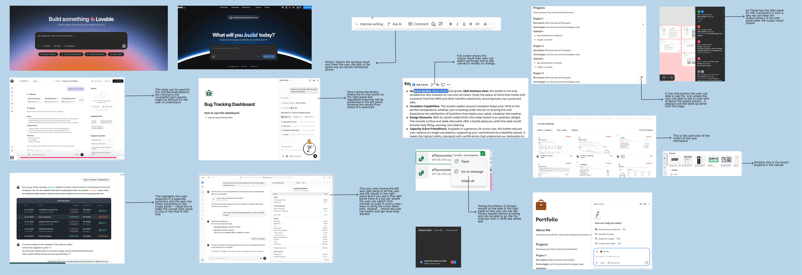
What the analysis surfaced
Gap — nothing connects the whole journey
No platform combined job search, CV, cover letter and document management in one place.
Gap — generation without personalisation
Most tools generate content but don't tie it to a specific job role.
Opportunity — conversation builds trust
AI conversational patterns can guide users through the application process while making the system feel less like a black box.
Sketch & wireframe
From paper to pixels, structure before styling.
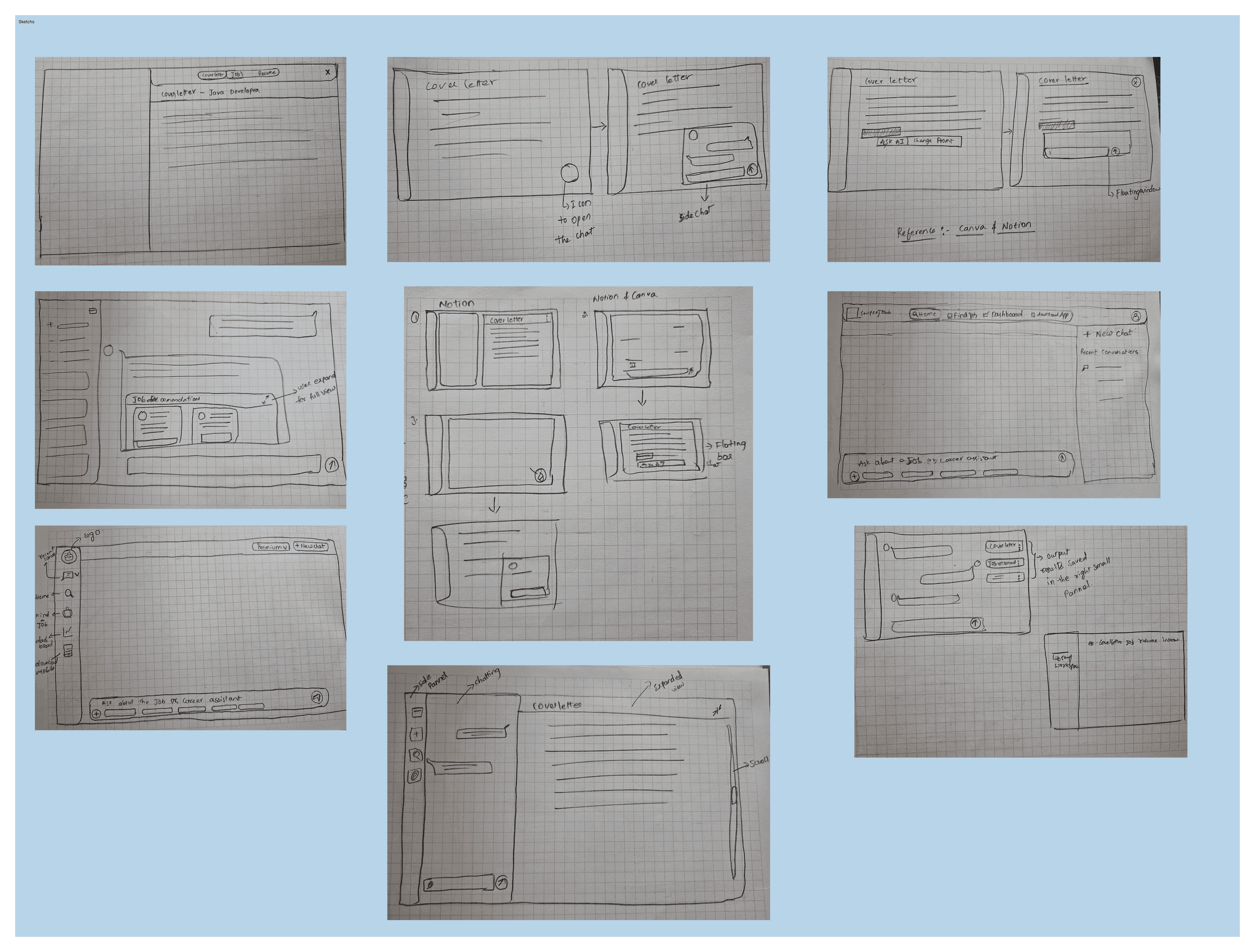
Rapid hand sketches
I started on paper to explore layout, navigation structure and AI interaction patterns without committing to pixels. The chat interface and library frames got the most attention, they were the two areas where the interaction model was genuinely unclear.
Low & mid-fidelity wireframes
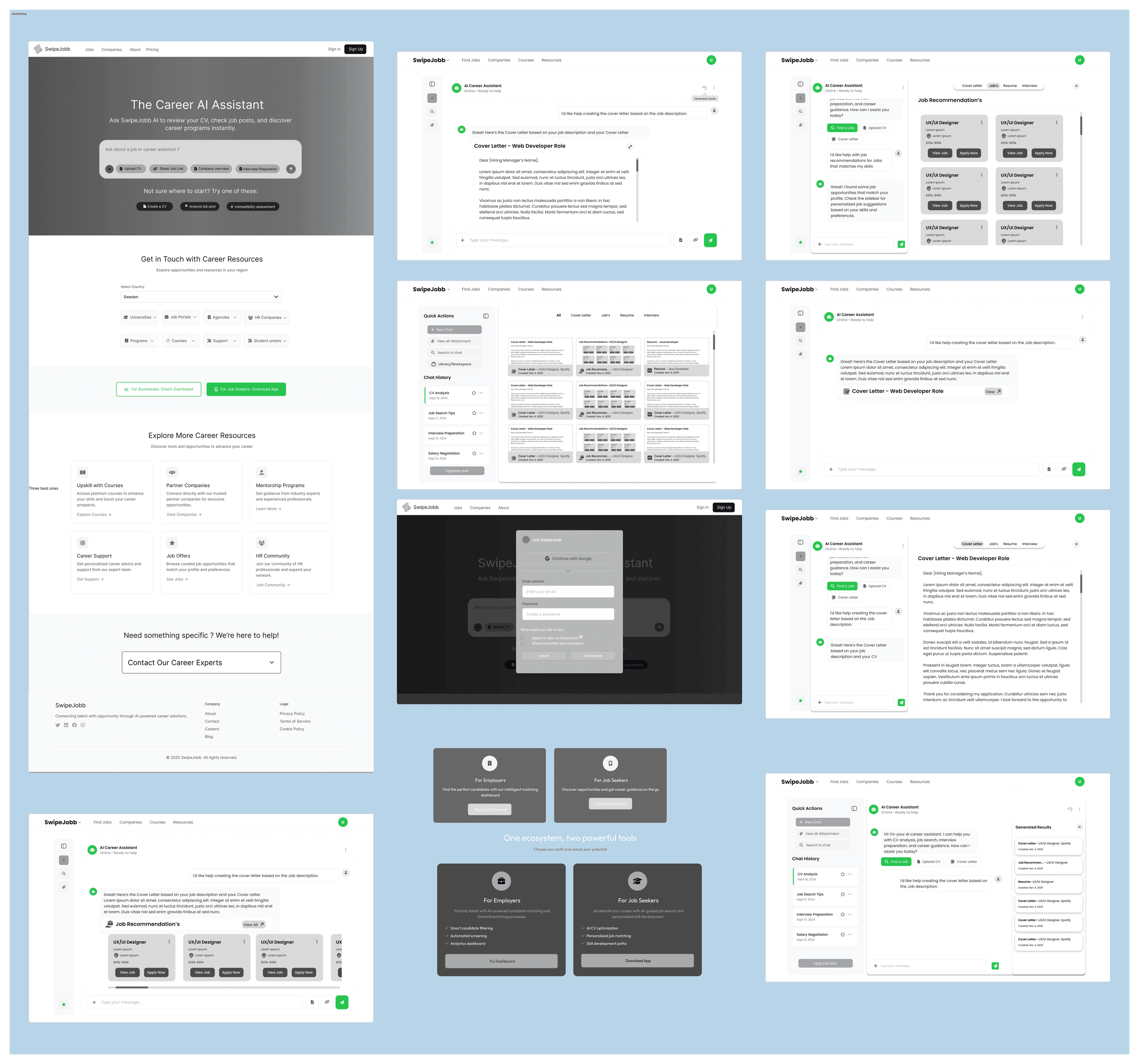
Once the structure held up, I translated the sketches into wireframes in Figma for all five flows, landing, cover letter, CV, jobs and library. Working in mid-fidelity let me test the information hierarchy with stakeholders before anyone got attached to a visual style.
Landing page
The entry point for someone who has never used an AI career tool.
The landing page had one job: introduce an AI career assistant clearly enough that a first-time visitor knows what to do within five seconds. Four sections carry that, each answering a different hesitation.
1 · Hero — The Career AI Assistant
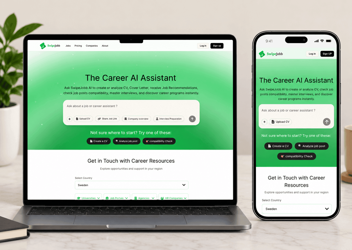
The green gradient signals the AI-powered nature of the product immediately. The central chat bar carries quick-action chips, Upload CV, Share Job Link, Company Overview, Interview Preparation, so users know what the product can do before they scroll.
2 · Quick action buttons
Guided entry points for users who don't know where to start. A first-time visitor facing an empty input box tends to leave; four concrete opening moves reduce that drop-off.
3 · Get in touch with career resources
Country-based filtering (Sweden shown) makes the platform feel localised rather than generic. Eight categories, universities, job portals, agencies, HR companies, programmes, courses, support and student unions, sit inside dropdowns so nobody meets a wall of links on arrival.
4 · Explore more career resources
Cards with green CTAs create a consistent visual rhythm, and each shows three examples so users know what's inside before they click.
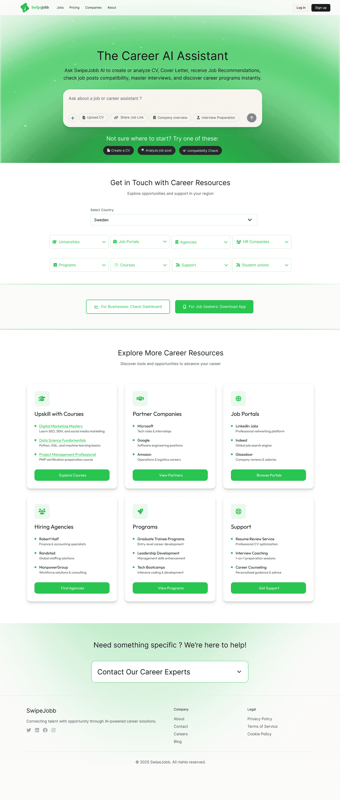
Every section of the landing page was designed to answer one question: what does a first-time job seeker need in order to feel confident and start?
Cover letter generation
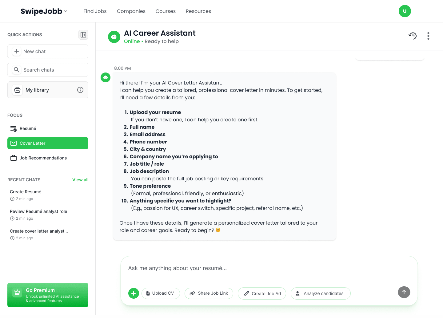
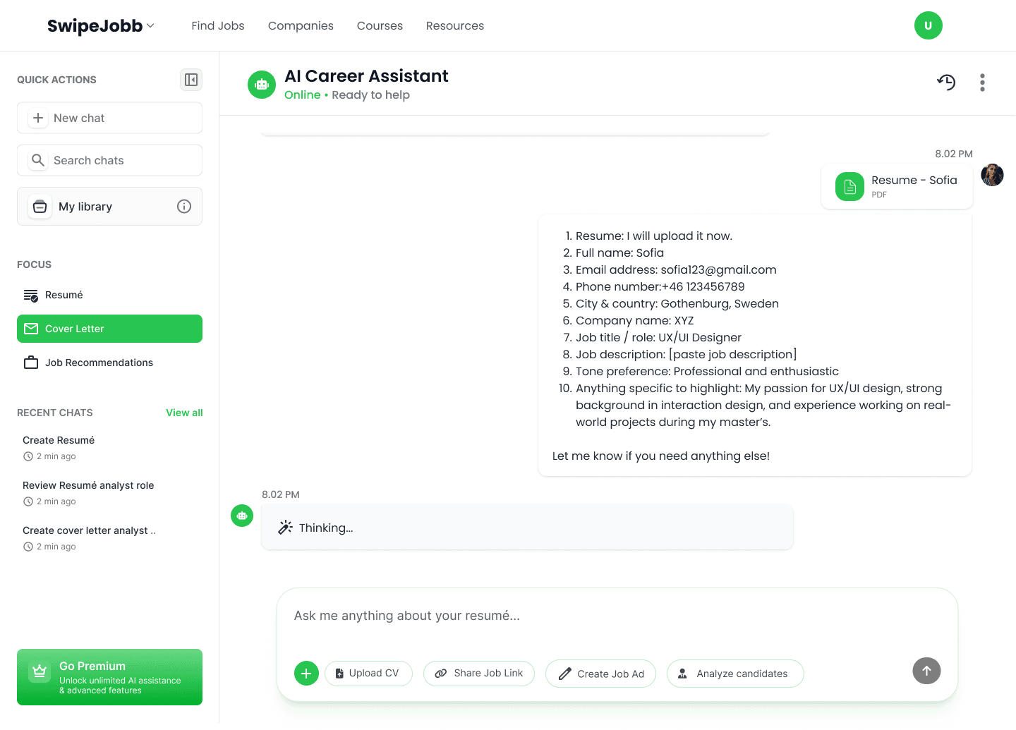
Ten quick inputs, and a letter that builds as you answer.
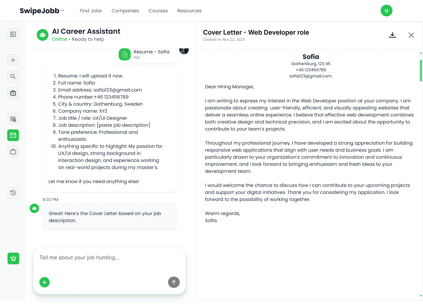
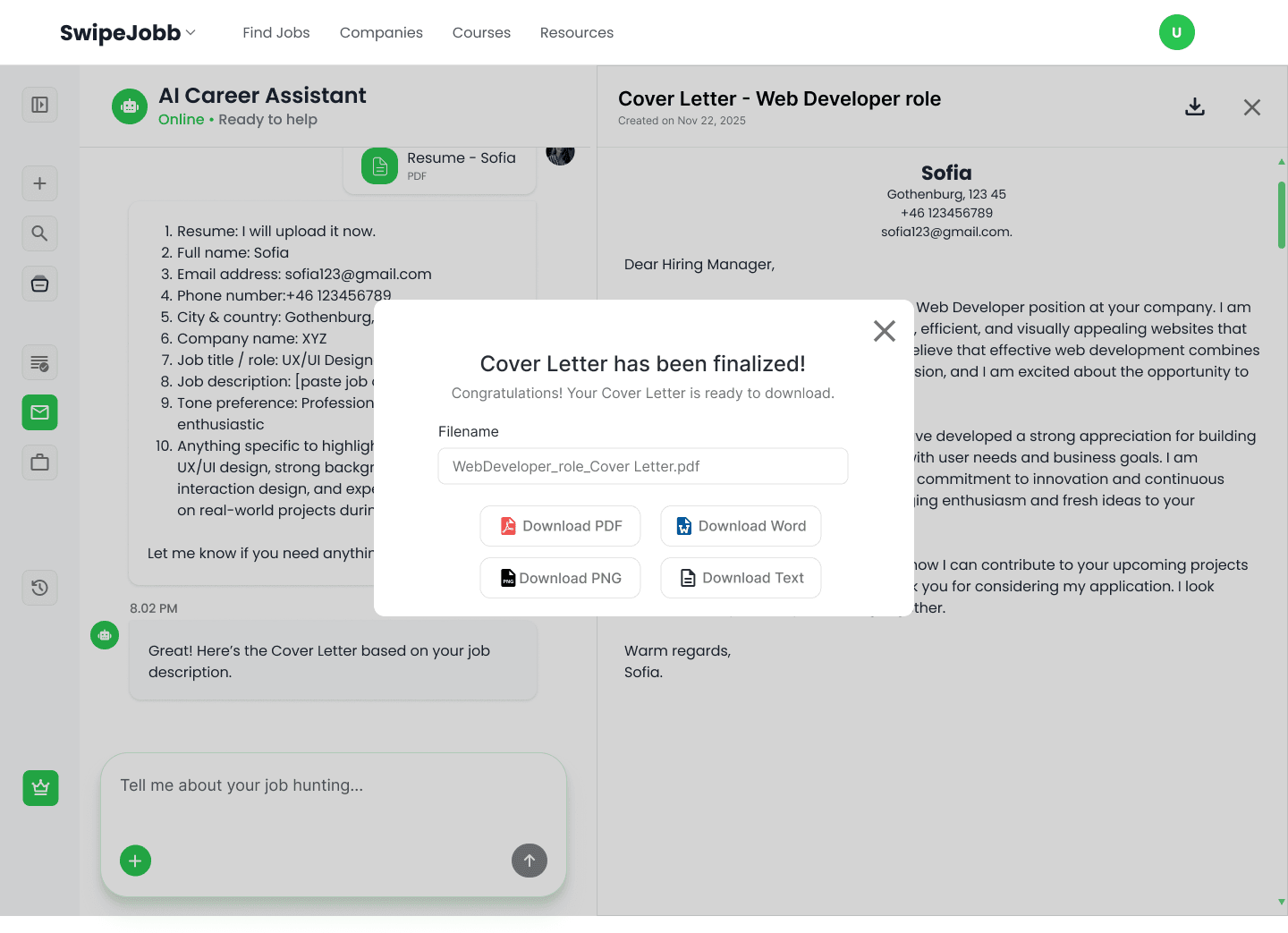
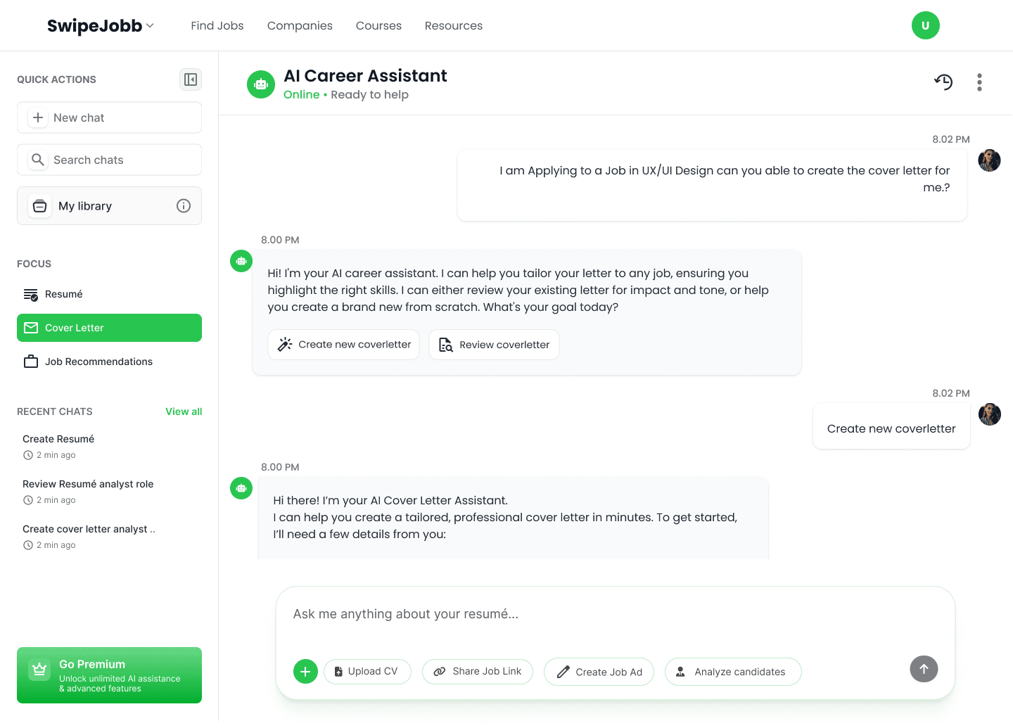
The AI assistant on the left walks the user through ten quick inputs, name, job role, job description, tone preference and more, while the generated letter builds in real time on the right. Once it's final, users export to PDF, Word, PNG or plain text, because different application portals want different things.
Job recommendations
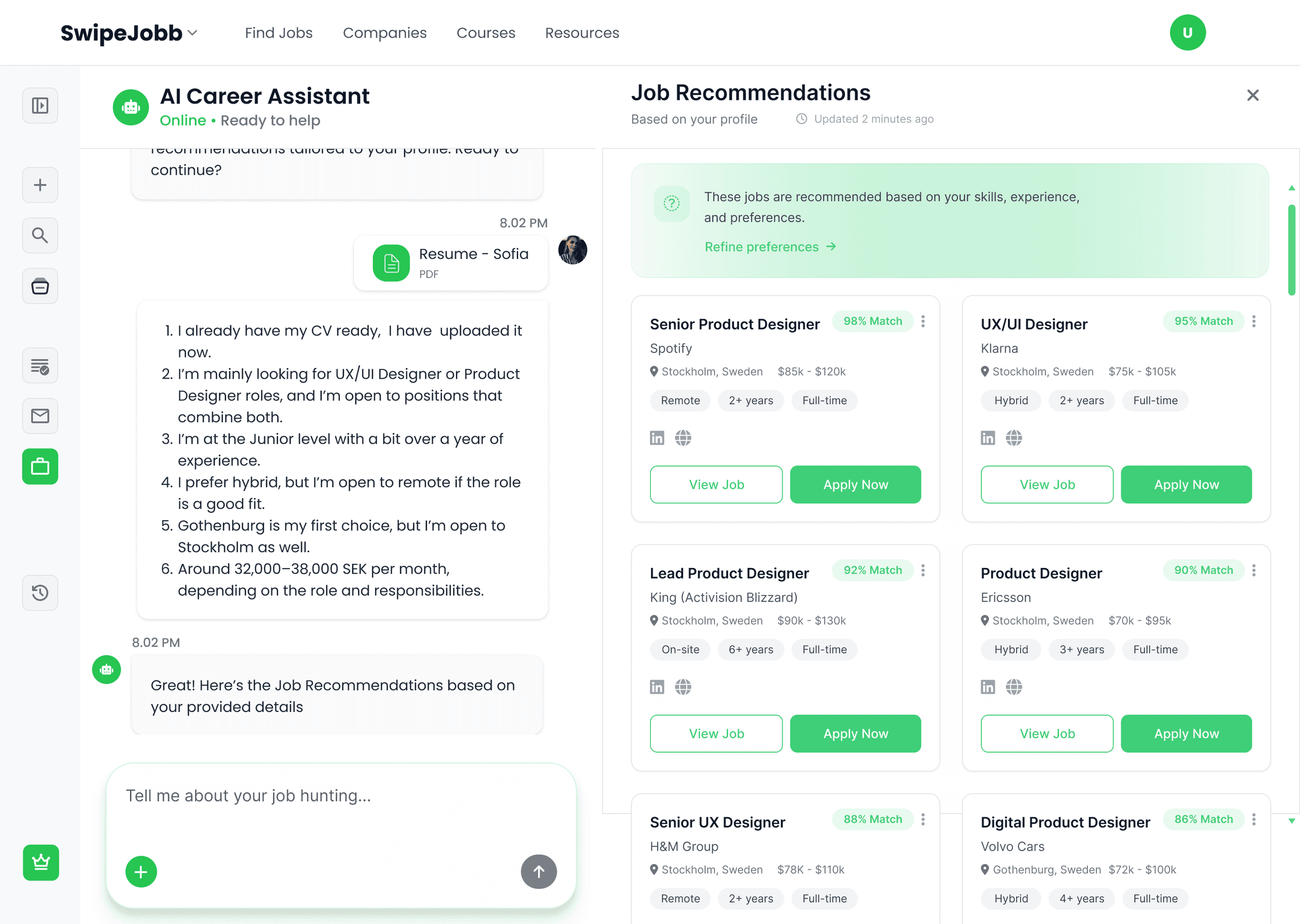
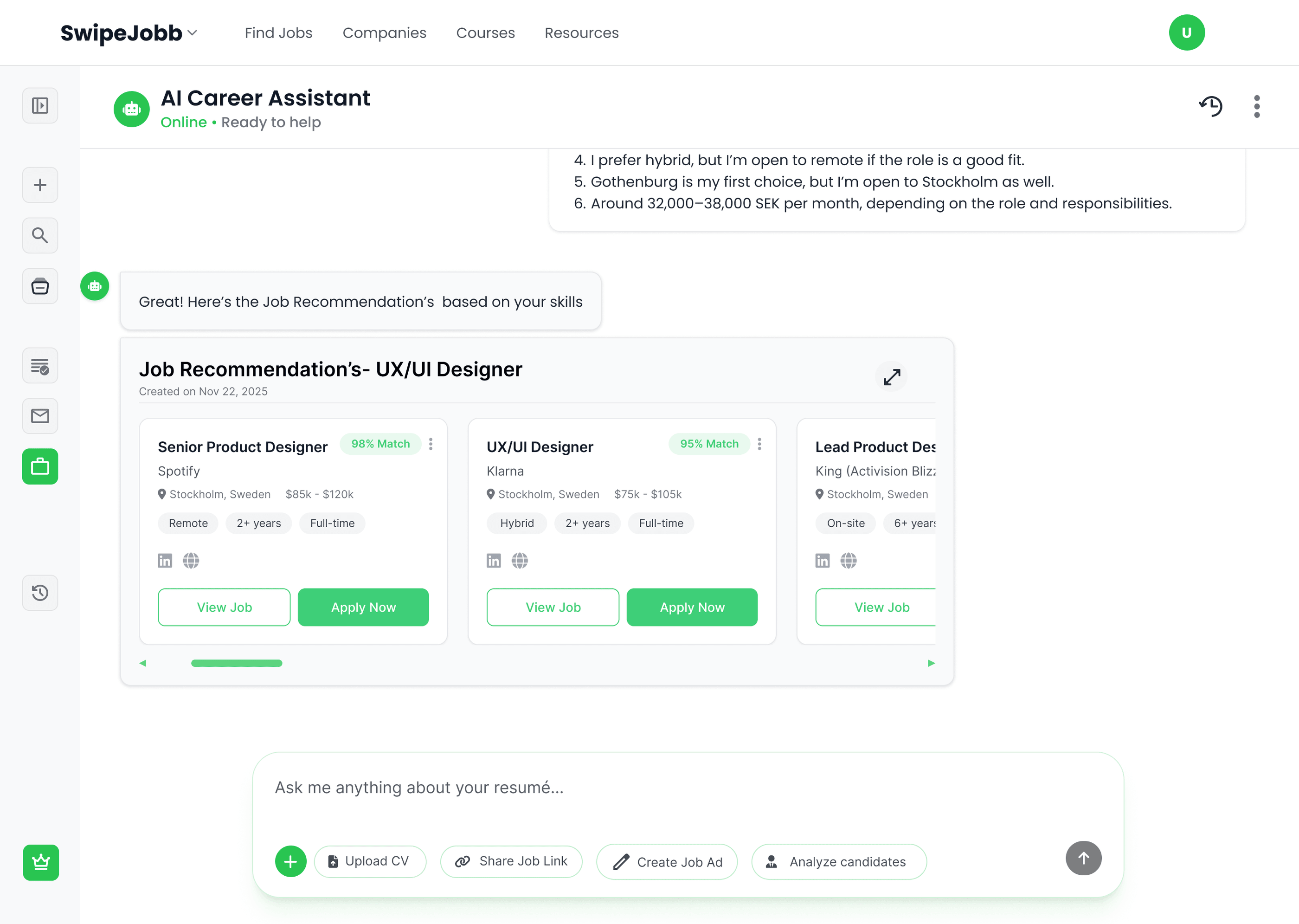
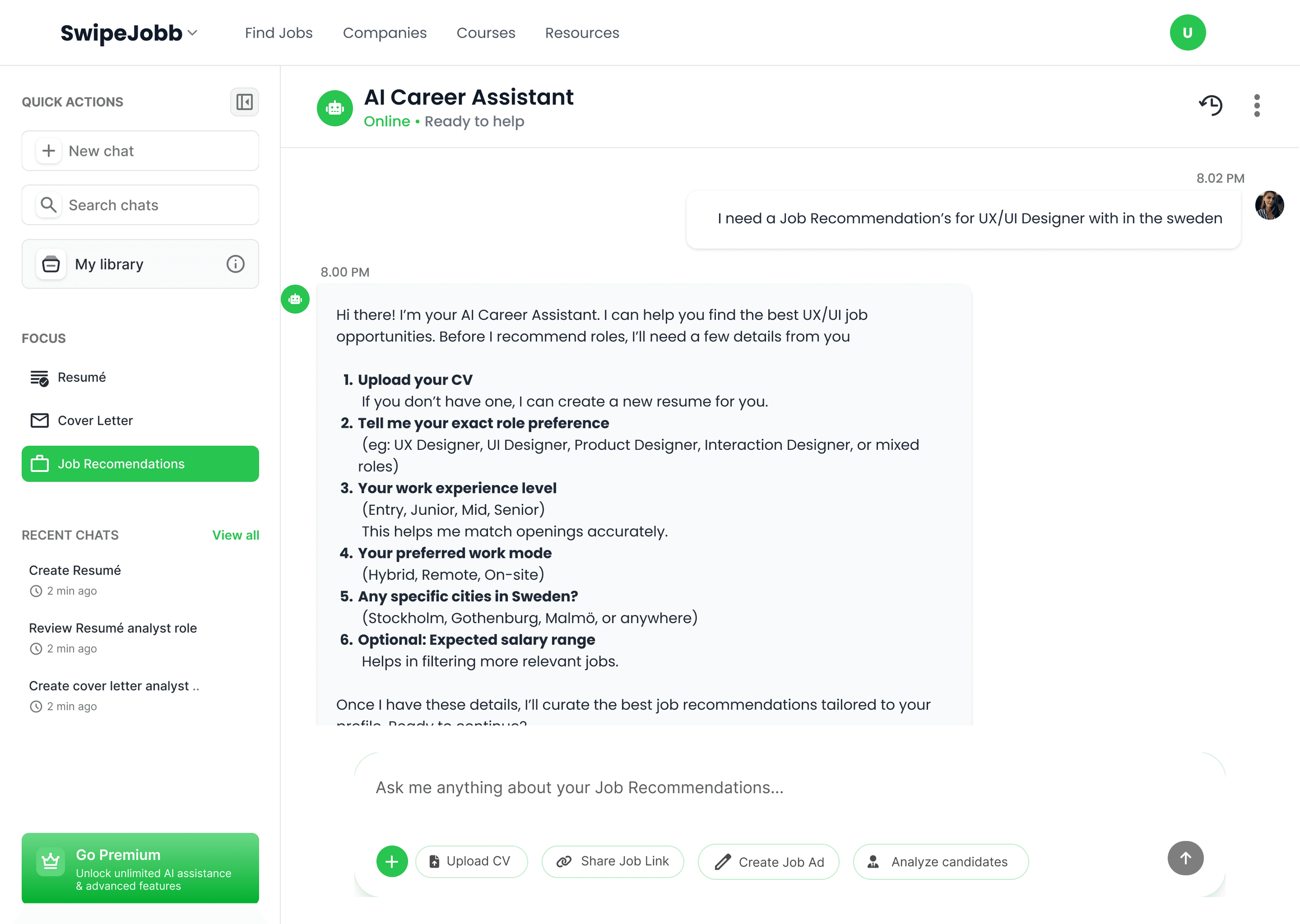
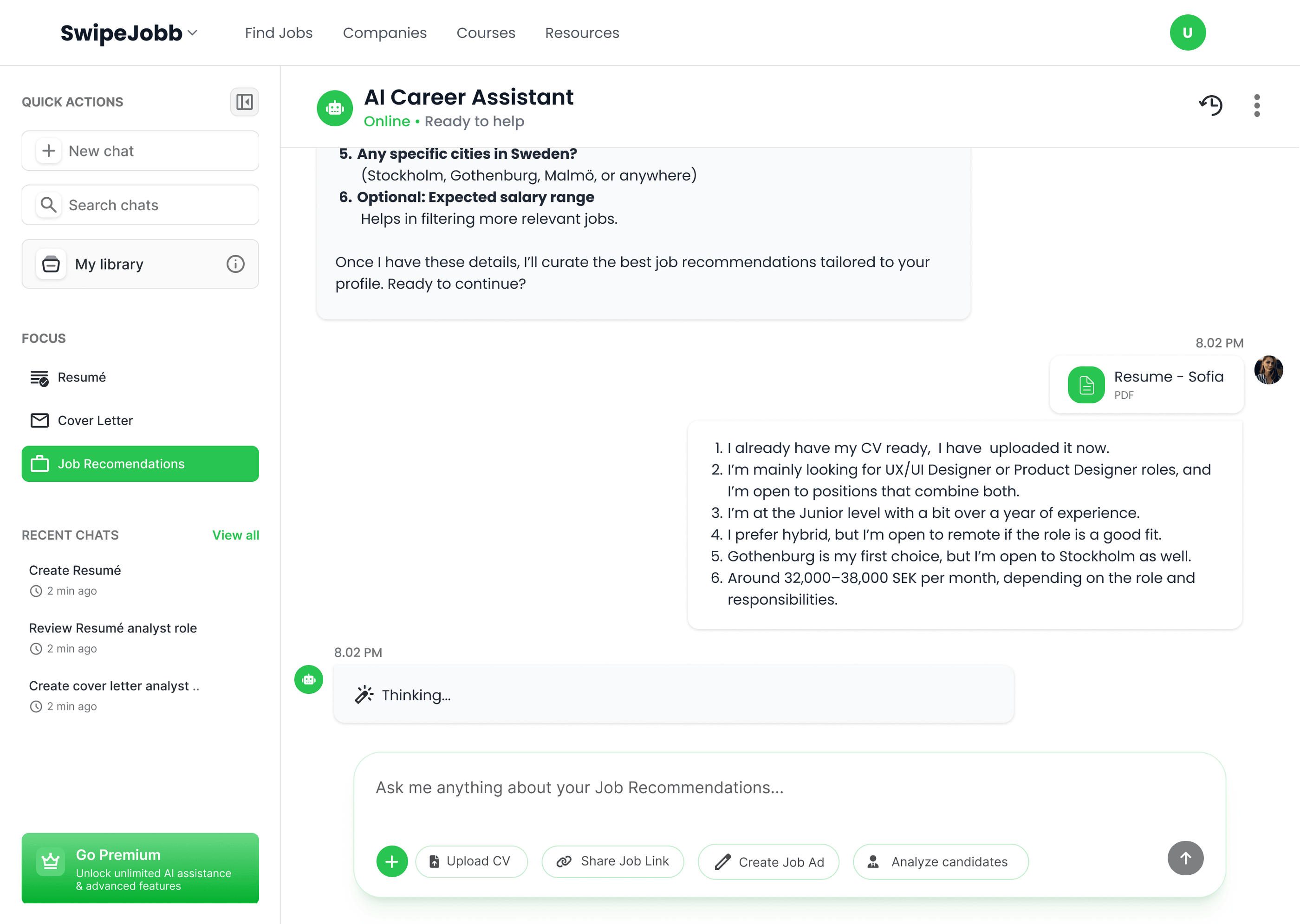
Six inputs in, ranked matches out.
Job recommendations reuse the same split-panel layout as the cover letter tool, consistency the user doesn't have to relearn. The assistant collects six inputs (role preference, experience level, work mode, location, salary range), then surfaces job cards ranked by match percentage. Each card carries title, company, location, salary, work type and experience level, so users can decide whether to apply without leaving the page.
Resume builder & analyser
Two entry paths, because people arrive in two different states.
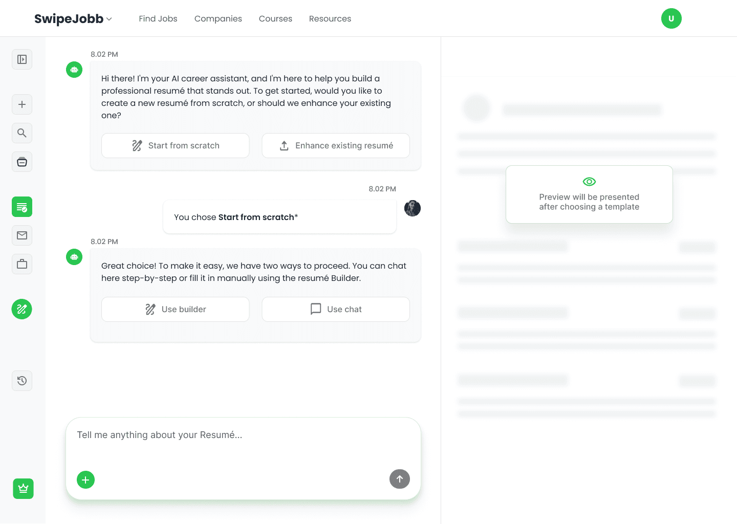
The CV builder is designed around two genuinely different user needs: people starting from nothing, and people improving something they already have. The opening screen asks which one you are, then asks how you'd like to work, guided by conversational AI, or through a structured manual builder at your own pace. Both paths produce the same output.
This feature was co-designed with a colleague; we contributed equally to the research, wireframing and final design.
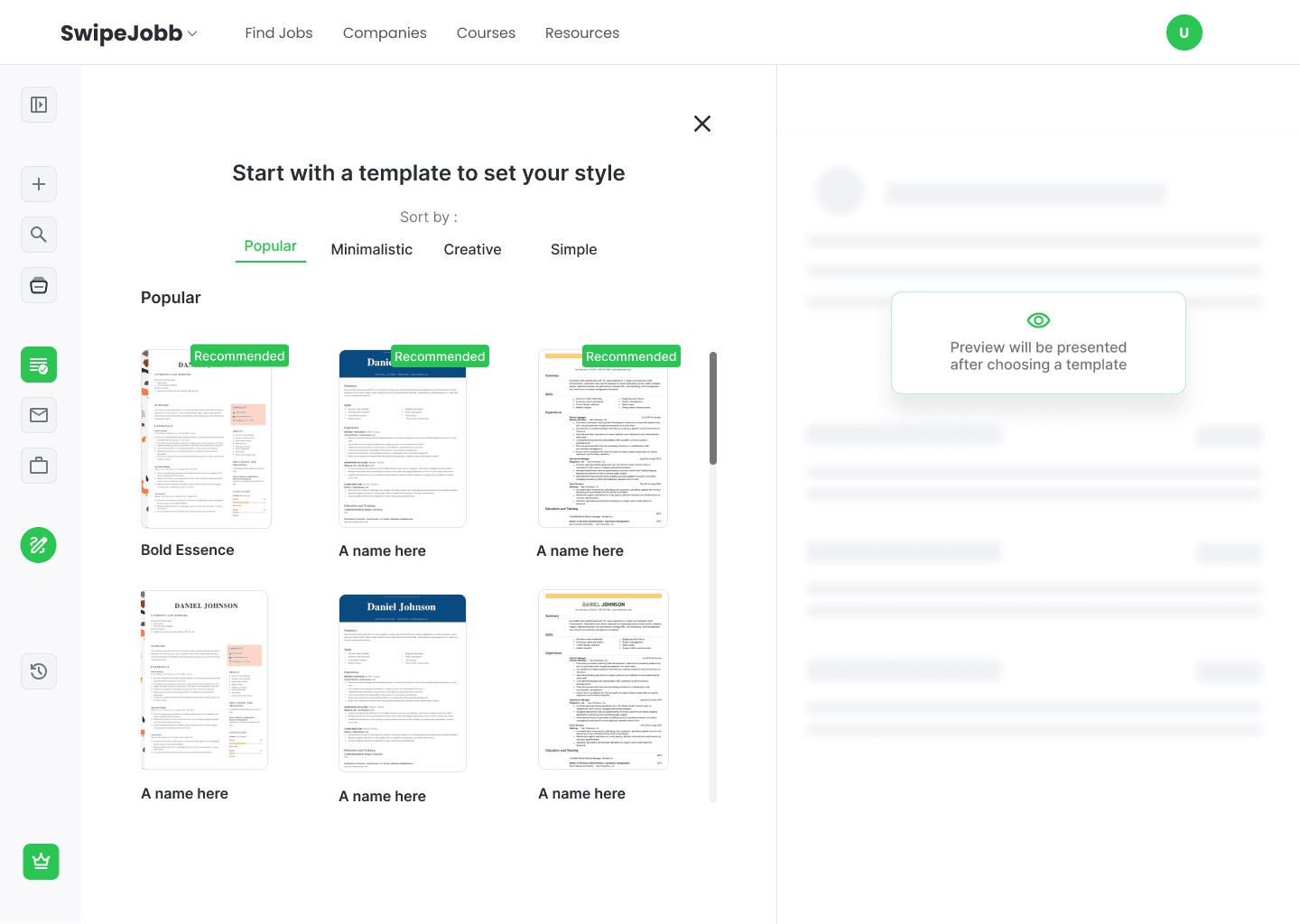
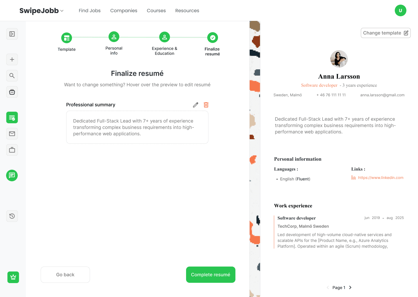
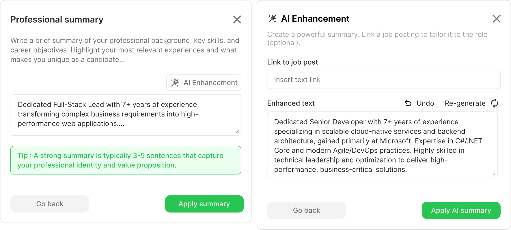
AI text enhancement runs throughout the flow: users can select a summary, an experience bullet or a skills line and rewrite it to be sharper and more relevant to the role they're targeting. This solves one of the core problems research surfaced, people know what they achieved, but struggle to say it well on paper.
The CV flow contains more than ten screens covering every state, edge case and interaction. Only the key screens are shown here.
Library
What turns a generation tool into a career workspace.
Everything the platform generates lands in the Library automatically, CVs, cover letters, job recommendations. Documents sort into tabs (All, Cover Letter, Jobs, Resume, Interview) so users find what they need without scrolling back through chat history. The grid view shows document type, title and creation date under each card.
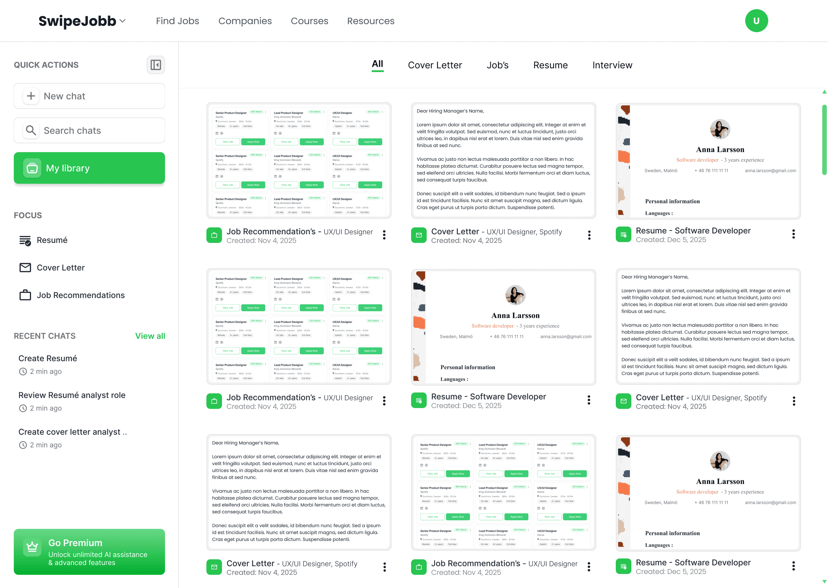
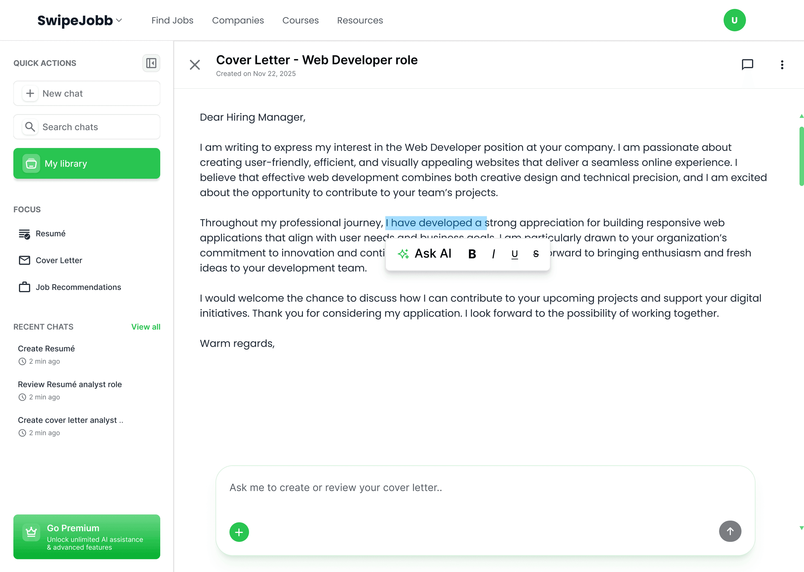
The Library is what turns SwipeJobb from a generation tool into a career management platform, a persistent workspace for the whole job search, not a one-shot output.
Design system & components
Built before the first high-fidelity screen, not after.
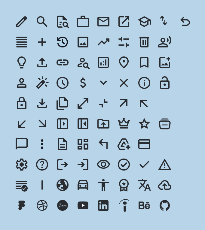
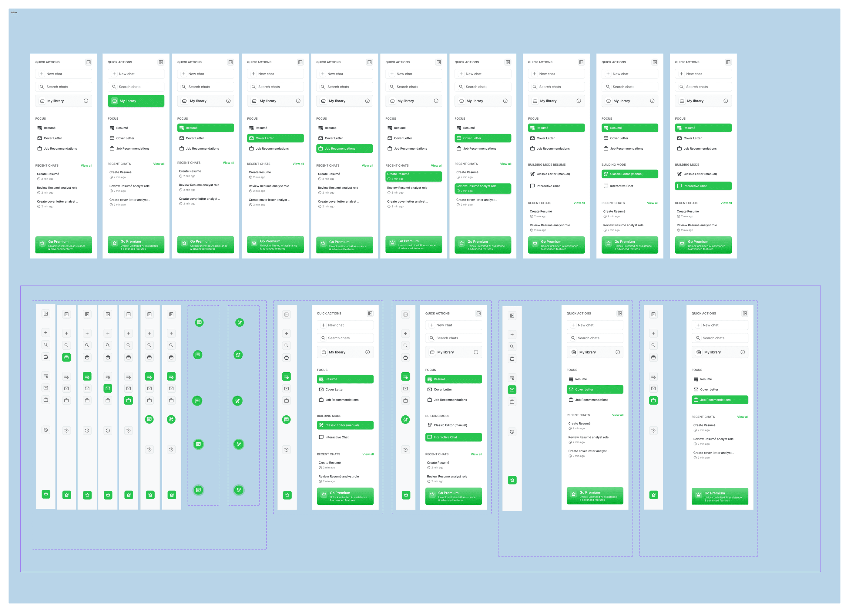
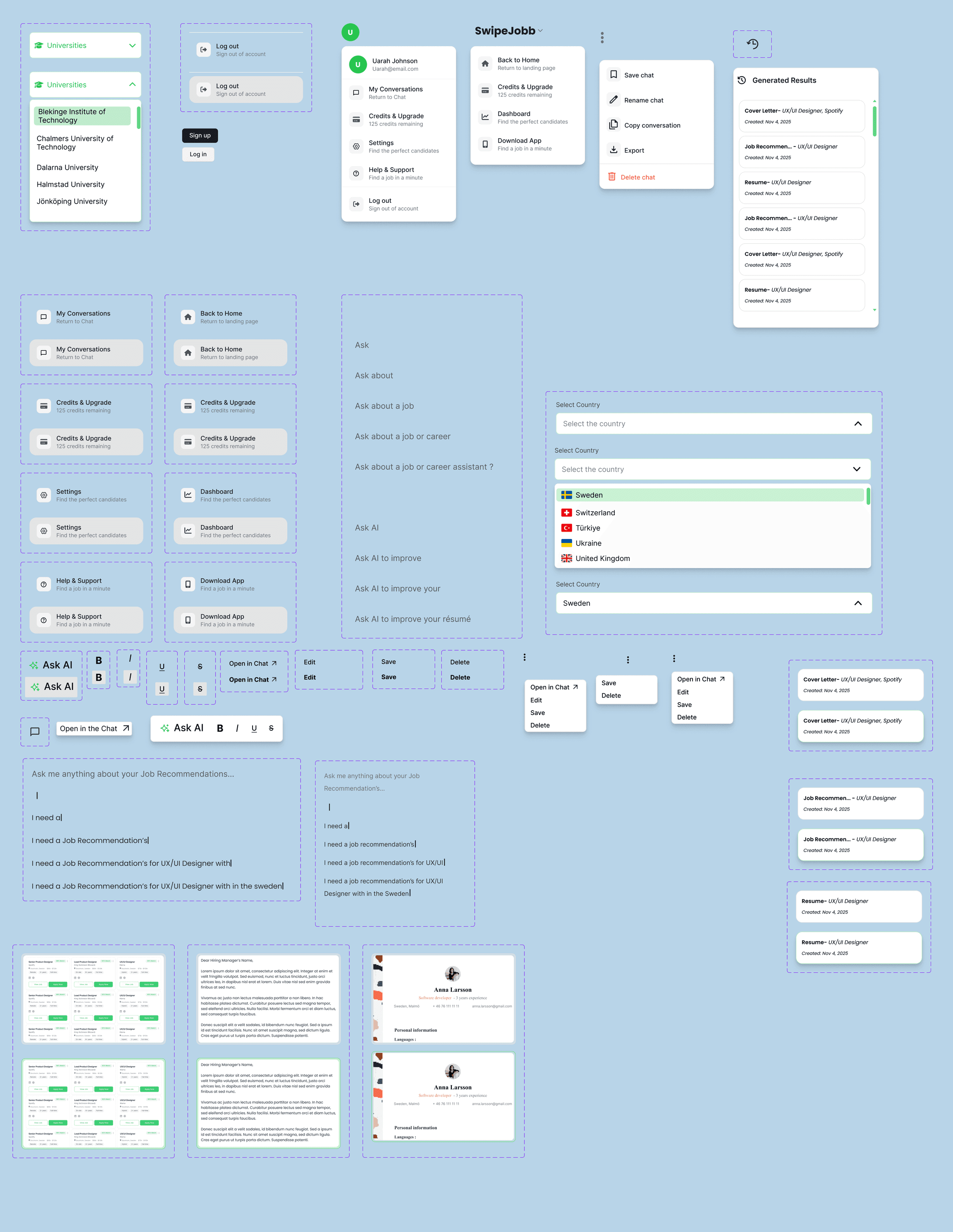
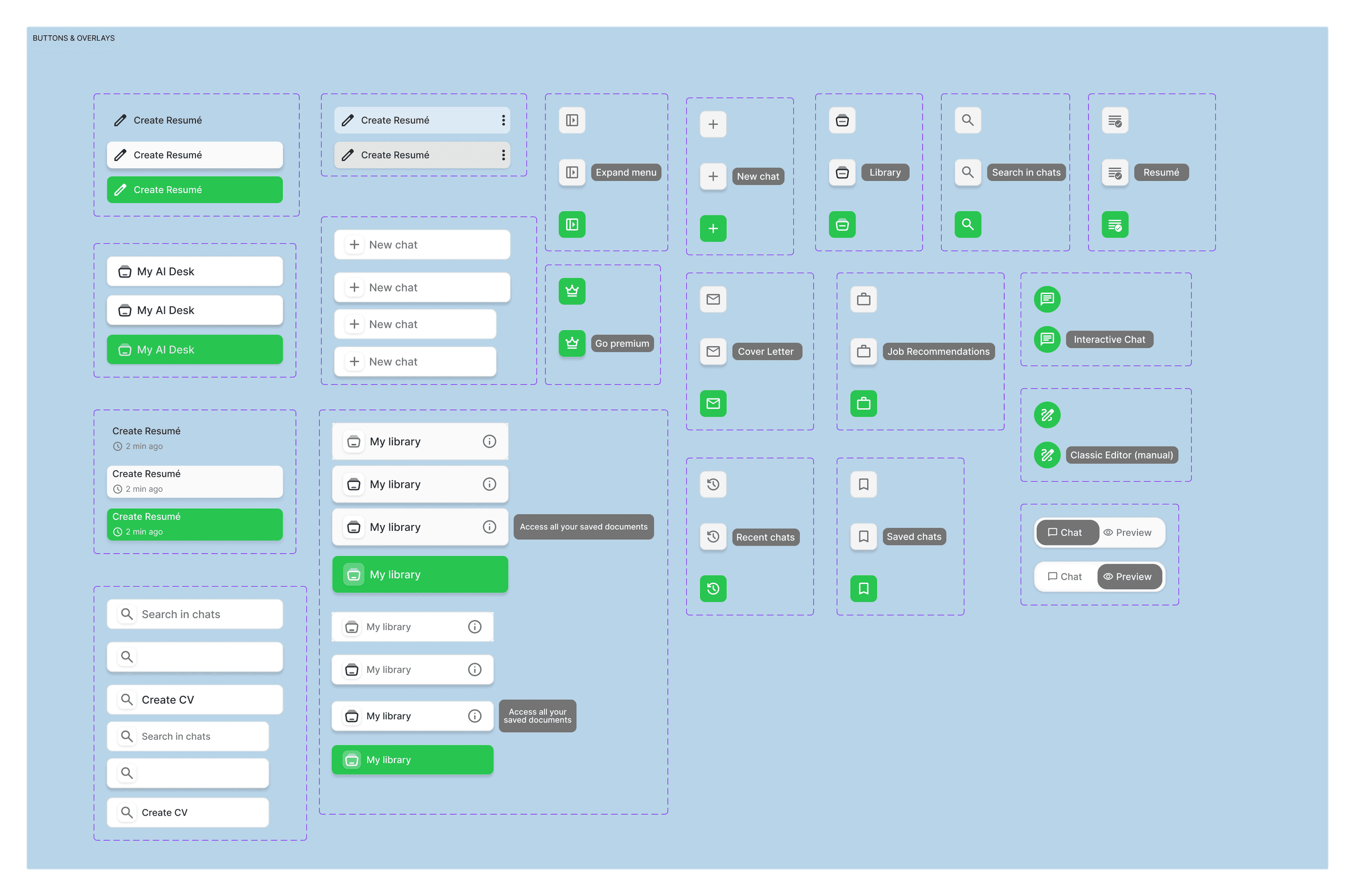
A component library in Figma covering buttons, input fields, cards, navigation, AI chat bubbles, icons, menu and hover states, profile and dropdown components, and status indicators. It kept the five flows visually consistent and made every later iteration faster.
User flows & button logic
Every screen, every decision point, every interaction state, documented.
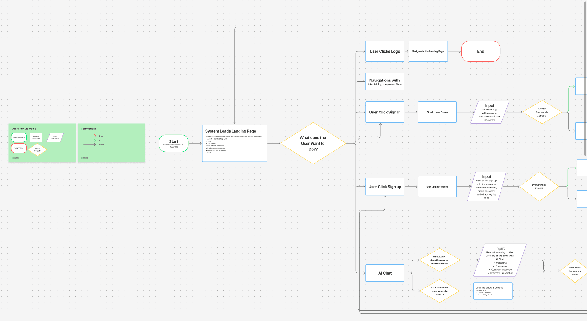
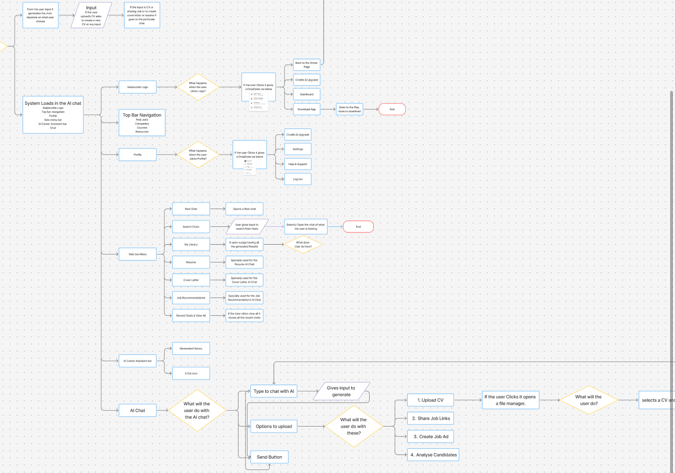
I mapped the main user flow across the whole platform: landing, authentication, into the AI chat and out across all five features. A second, deeper flow documents the chat screen itself, how the system loads, how navigation behaves, and how every user action inside the chat is handled.
Button flow
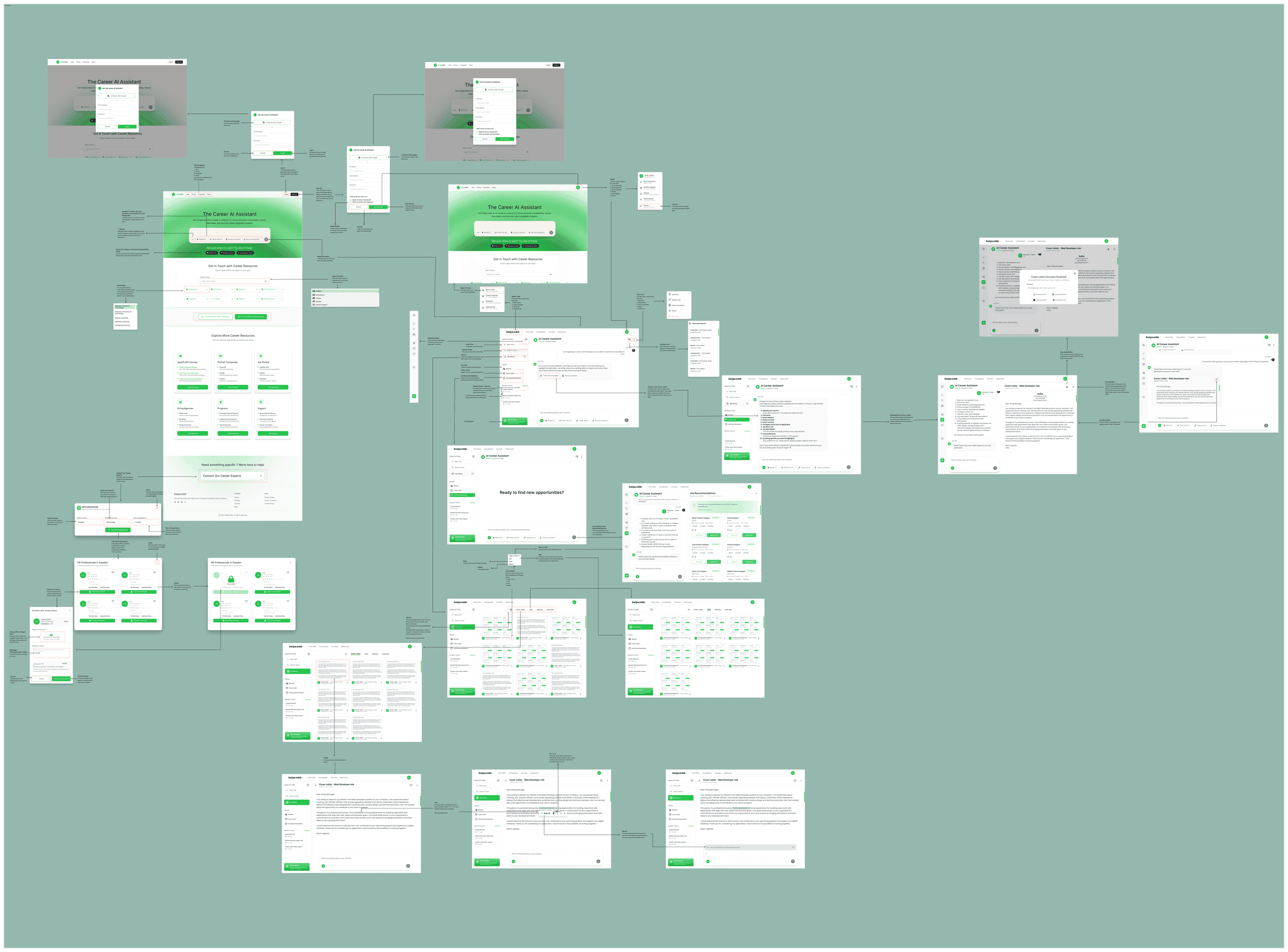
The button logic map covers every clickable element on the platform: what each button does, where it goes, and what happens in each interaction state. It exists for one reason, so that nothing is ambiguous when developers pick it up.
Prototype
All five flows wired into one interactive Figma prototype.
Every high-fidelity screen was connected into a fully interactive prototype simulating the complete product across all five core flows, including transitions, loading states and error states, so stakeholders and testers got a realistic feel for the product before a line of code was written.
Product validation & usability testing
Five moderated sessions, built on a testing foundation laid before anyone sat down.
- Moderated sessions
- 5
- User personas
- 4
- Features risk-rated
- 5
- Pain point clusters
- 4
Moderated product validation and usability testing were conducted with 5 participants. Before running sessions, a solid testing foundation was built, including user personas, a risk matrix to surface assumptions early, and structured quantitative and qualitative signal frameworks to ensure consistent and measurable outcomes across all sessions.
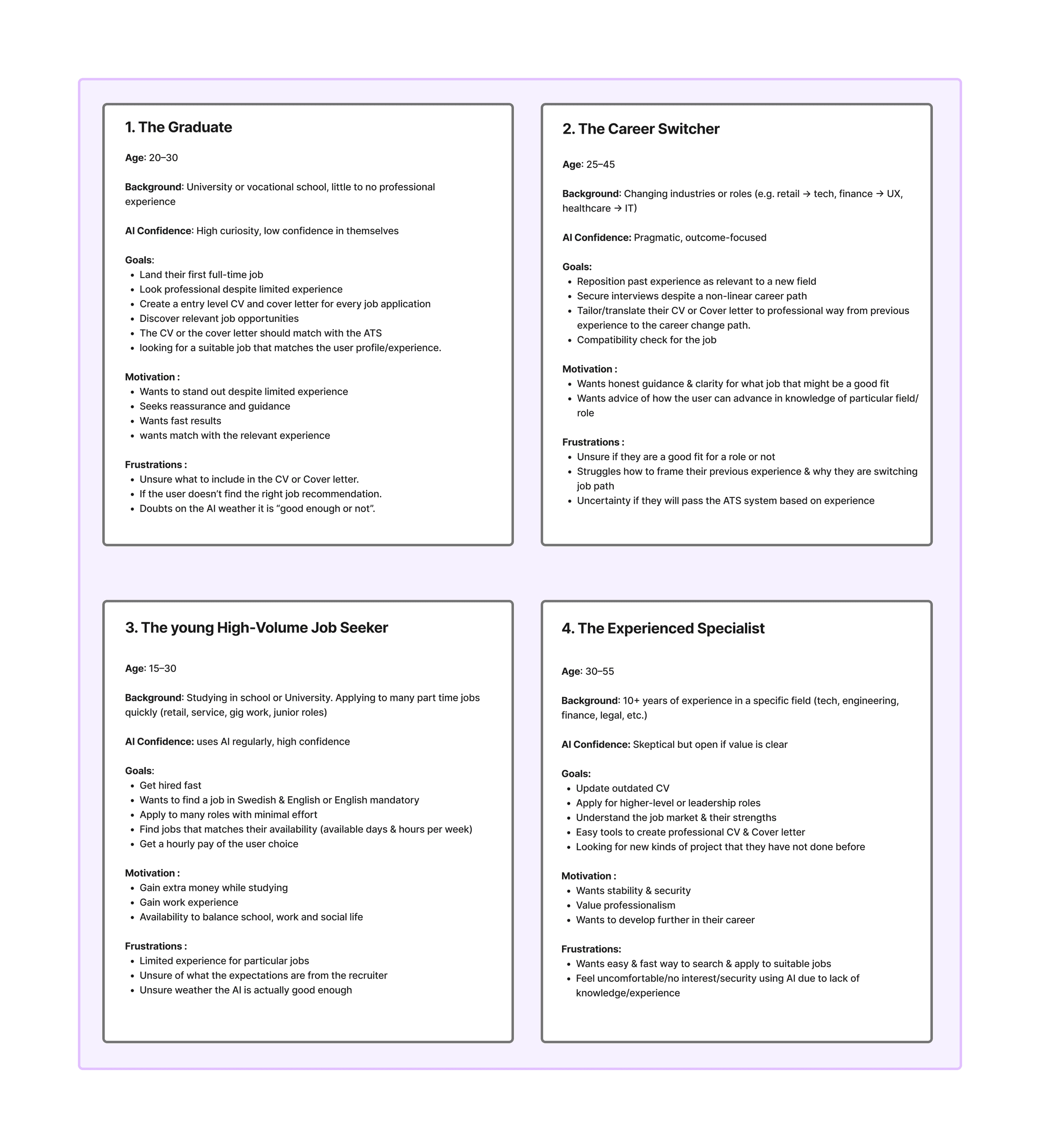
Personas
Four personas representing the core user groups: The Graduate, The Career Switcher, The Young High-Volume Job Seeker and The Experienced Specialist, each capturing age, background, AI confidence level, goals, motivations and frustrations.
Risk matrix
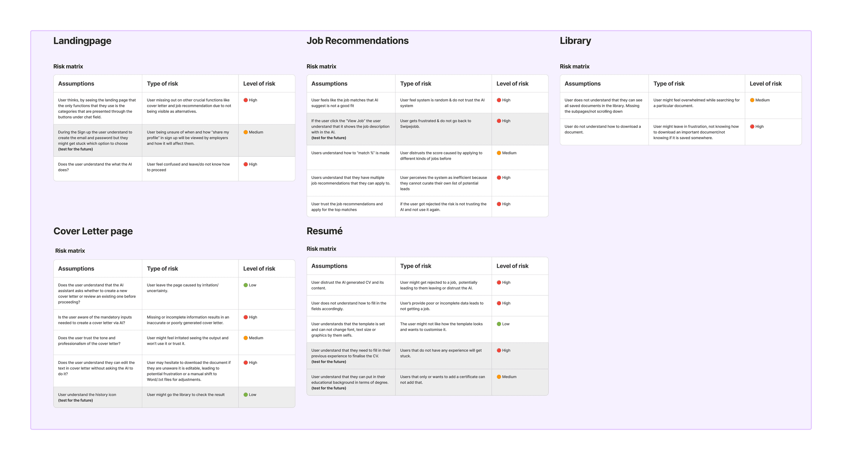
Prepared before testing, covering all five core features. For each, I identified the assumption, defined the type of risk, and rated it High, Medium or Low, so the team knew what needed validating most urgently, and which decisions carried the most cost if the assumption was wrong.
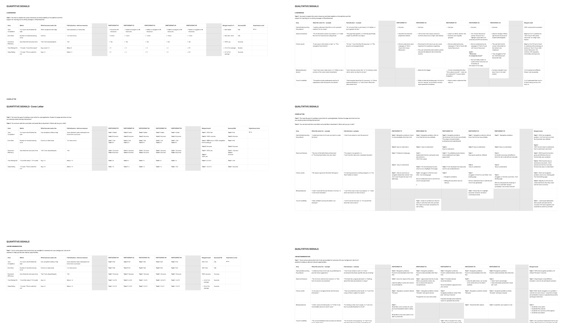
Quantitative & qualitative signals
Task completion and measurable behaviour patterns alongside sentiment, confusion points and unprompted feedback, captured for every core feature, across all five participants.
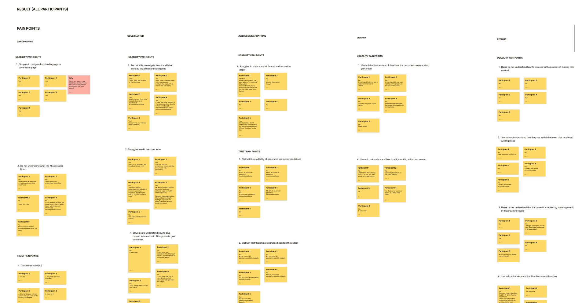
Pain point analysis
Findings grouped by feature area: navigation confusion on the landing page, trust issues with AI-generated content, difficulty giving the AI good enough input, and confusion in the library's document editing flow. Each mapped to a specific design iteration.
Testing wasn't the end of the process. Every insight fed back into the design, the final prototype is significantly more refined than where it started.
Outcome
What it delivered
Five flows shipped to development-ready
Landing, cover letter, job recommendations, CV builder and library, delivered as an interactive prototype with a component library, complete user flows and documented button logic for every interaction state.
Assumptions de-risked before build
The risk matrix surfaced the highest-cost assumptions before testing, so the five sessions were spent validating what actually mattered rather than confirming what we already knew.
Every pain point became an iteration
All four pain-point clusters from testing, landing page navigation, AI trust, input quality and library editing, were mapped directly to design changes rather than logged and forgotten.
Product thinking, not just screens
The work covered identifying the market gap, defining the solution scope and validating it with real users, not only designing the interaction patterns.
Reflection
What I learned, and what I'd change
The single most valuable decision was building the risk matrix before testing. It turned five sessions from a general 'does this work?' into targeted validation of the four assumptions that would have been most expensive to get wrong.
If I ran it again I'd test the landing page separately and earlier. It was the one area where navigation confusion showed up across participants, and it's also the cheapest screen to iterate on, testing it in isolation before the full flow would have caught that a lot sooner.