DevPort
Intranet redesign
- Company
- DevPort AB
- Role
- UX/UI Designer — Master's Thesis
- Timeline
- 6 months · 2025
- Team
- With one thesis partner
- Tools
- Figma, Microsoft Forms, Miro
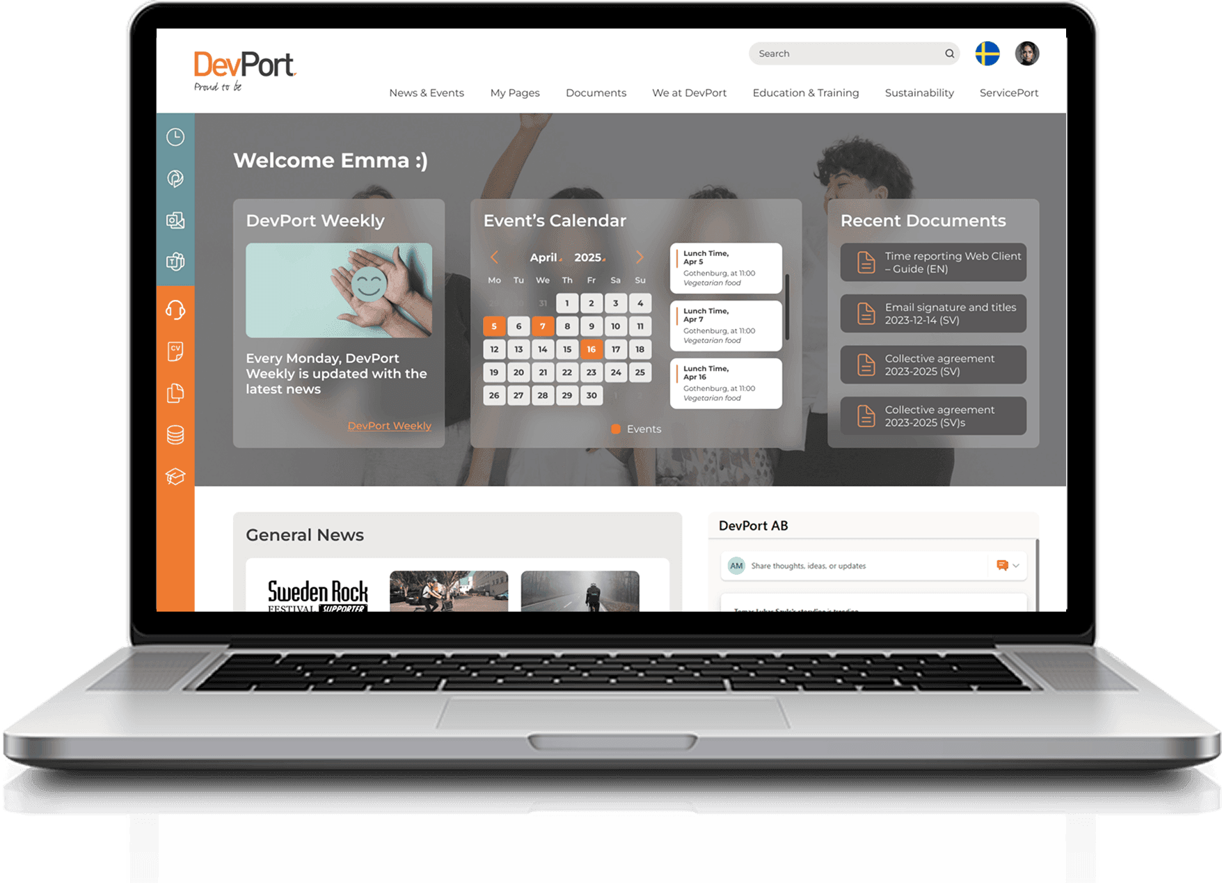
The problem
DevPort's intranet was cluttered and hard to navigate. Employees struggled to find documents, understand the structure, and finish simple tasks, so they stopped using it.
My role
With a thesis partner, I ran the full double-diamond process: surveys with 40 employees, six one-on-one interviews, MoSCoW prioritisation, two rounds of wireframes, high-fidelity design and task-based usability testing.
The outcome
A restructured information architecture validated in testing, all six participants found the redesign easy to navigate and documents easy to locate, and the new resume feature was rated the most valuable addition.
Background
Corporate intranets fail quietly. People just stop opening them.
Many corporate intranets are cluttered and difficult to navigate, which costs time and creates daily friction. At DevPort, employees struggled to find documents, understand the structure, and complete simple tasks.
As part of my Master's thesis in Interaction Design, I redesigned the intranet to make it genuinely usable. The project focused on understanding what employees actually needed, identifying which content carried real value, and improving the structure to reduce friction in everyday workflows.
Understanding the problem
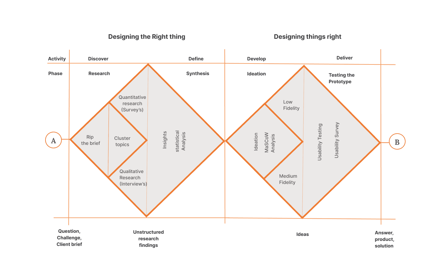
Double Diamond, starting in Discover.
I began in the Discover phase to understand employee needs and pain points. The existing intranet was hard to navigate, content was scattered, and engagement was low. Surveys and one-on-one interviews surfaced recurring issues in navigation, content organisation and feature visibility, and those findings set the direction for everything that followed.
The intranet as it was
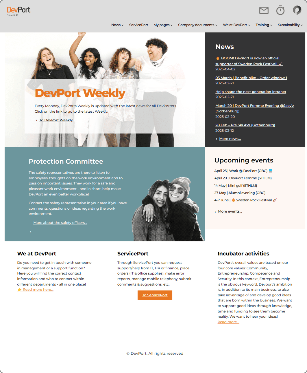
Before changing anything, it's worth seeing what employees were actually working with. The old homepage led with news and a weekly feature, with no calendar, no search and no route to the things people came for.
Project focus
Restructure the information architecture
Create a more accessible, efficient and intuitive experience for finding and using content.
Align IA with business goals
Reduce user frustration and increase productivity, without losing what the organisation needed the intranet to do.
Research with people, not about them
Apply participatory research involving employees and stakeholders so the redesign reflects real behaviours, not assumed ones.
Research
40 survey responses, then six interviews to find out what the numbers meant.
- Survey responses
- 40
- One-on-one interviews
- 6
- Asked for a direct CV link
- 100%
- Found menu names unclear
- 50%
Quantitative — surveys
We gathered responses from 40 employees through Microsoft Forms, asking how often they used the intranet, what they relied on it for, and what got in their way. The pattern that emerged wasn't that the intranet was broken, it was that people were getting by without ever feeling confident.
Basic functionality works for most users, it isn't broken, it's just slow.
Almost as many neutral as agree. Users don't struggle heavily, but confidence stays weak, and that gap is where time gets lost.
- News & updates14
- Documents10
- Entry points & search7
- Business & productivity tools7
- Employee support & resources5
- Learning1
These matched the company's own internal usage statistics, which confirmed the self-reported data was reliable.
- UI design8
- News & updates7
- Entry points & search7
- Documents5
- Employee support & resources4
- Business & productivity tools2
Interface quality topped the list, ahead of any single piece of content.
Qualitative — interviews
To find out what sat underneath the numbers, we ran six one-on-one interviews with consultants, HR and managers. These surfaced deeper pain points, a cluttered menu, difficulty locating resources, and one clear opportunity: redesigning the CV feature into something collaborative rather than static.
Interview analysis
Responses coded by theme and expressed as a share of interviewees, so a split opinion is visible rather than averaged away.
- Prefers menu100%
- Mentions links25%
- Feels organised50%
- Needs labelling50%
- Wants better layout50%
- Missing CV / benefits50%
- Missing search50%
- Missing calendar50%
- Feels complete25%
- Positive50%
- Neutral / unsure50%
- Wants CV link100%
- Links work well50%
- Wants improved layout25%
- Better grouping50%
- Wants foldable sections50%
Key findings
Menu navigation is the primary route
Every interviewee reached for it first, so its labels carry disproportionate weight.
Half found menu names unclear or repetitive
Labels that made sense internally didn't make sense to the people using them.
The homepage was missing the essentials
No calendar, no search, no CV quick links, the three things people came for.
Everyone wanted direct CV editing
100% of interviewees requested a direct link to edit their CV. Not a single dissenting view.
Documents needed better grouping
Requests for clearer folder structure and collapsible groups.
Split opinion on polls
Not everyone wanted the intranet to be fun, worth knowing before designing for engagement.
MoSCoW prioritisation
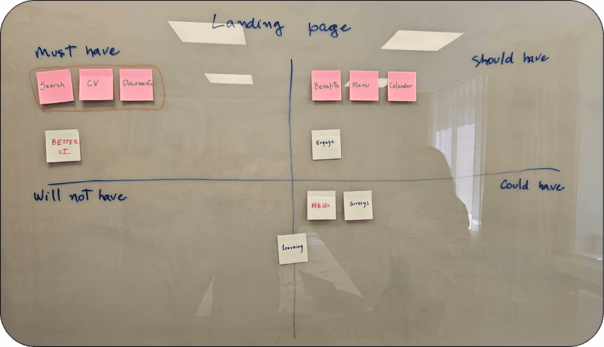
MoSCoW analysis turned the research into a scope. Features were sorted into Must have, Should have, Could have and Won't have based on what users actually needed rather than what was easiest to build.
Top priorities landed clearly: Documents, CV and Search.
Wireframing
Two iterations, and a clear shift between them.
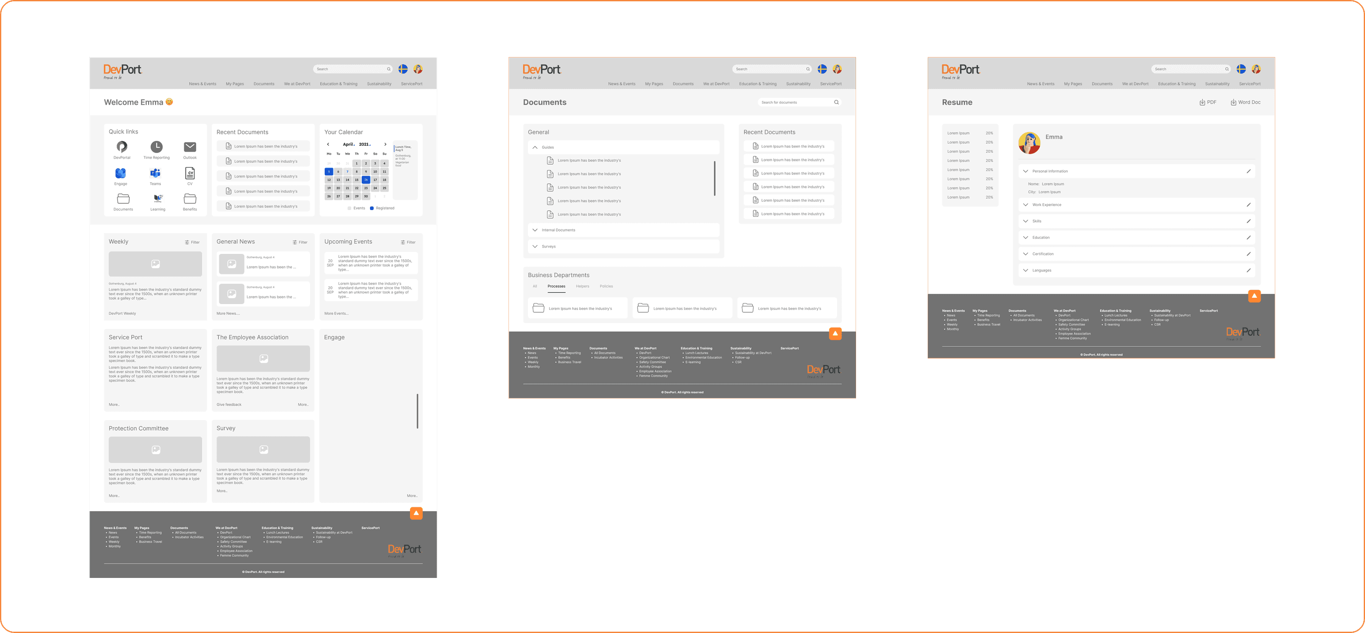
First wireframe
The initial wireframe outlined the structure and key functionality, positioning the intranet as a central hub by bringing external resources onto the main page, making it a core tool for consultants rather than somewhere they visited when forced to.
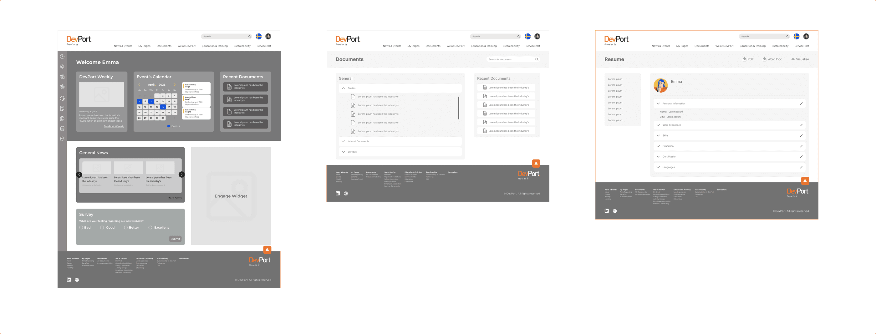
Second wireframe
In its second iteration the design was noticeably more refined and better aligned with DevPort's needs, with the clearest adjustments in the sitemap and the footer, where the first version had been trying to do too much.
High-fidelity design
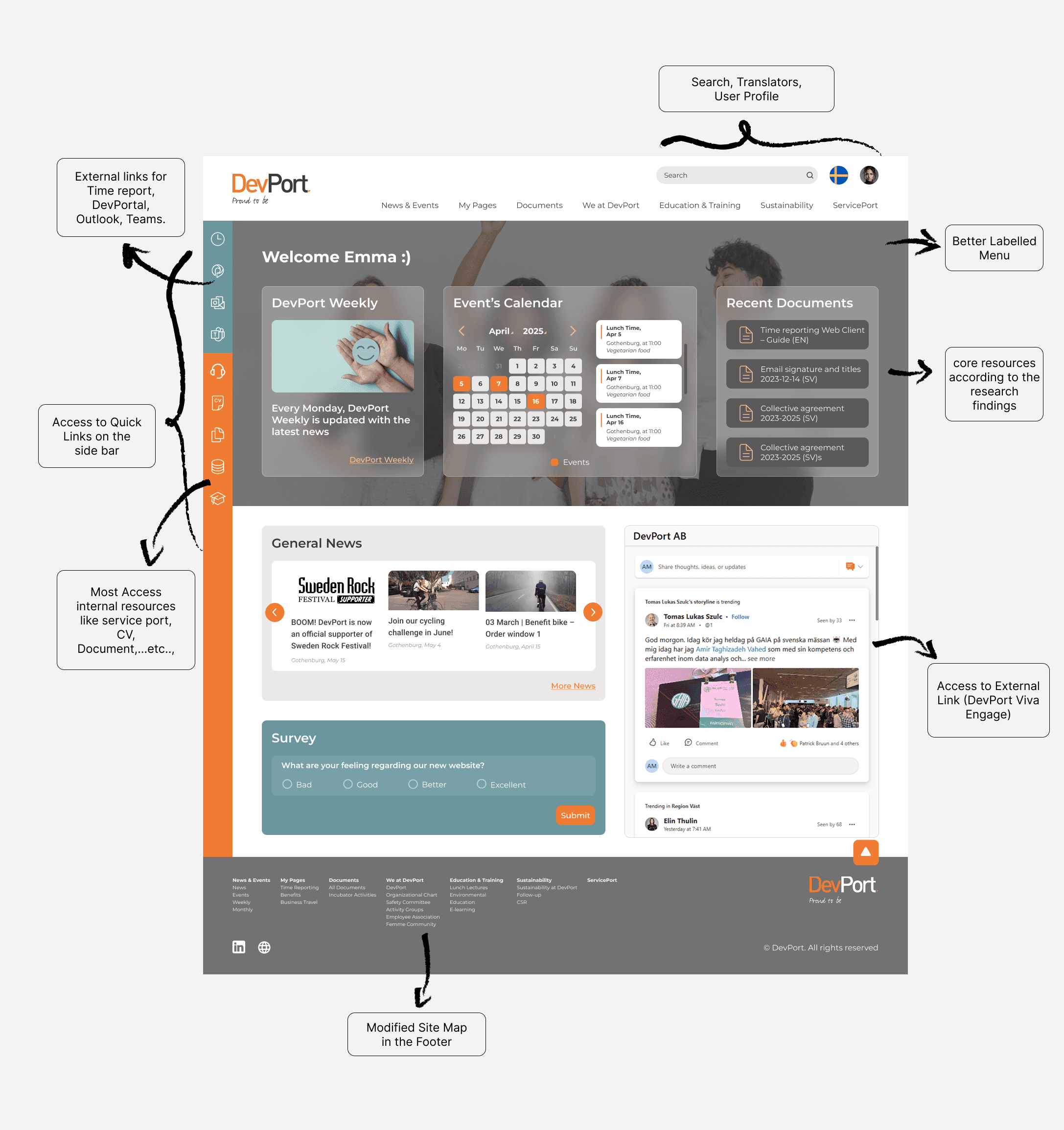
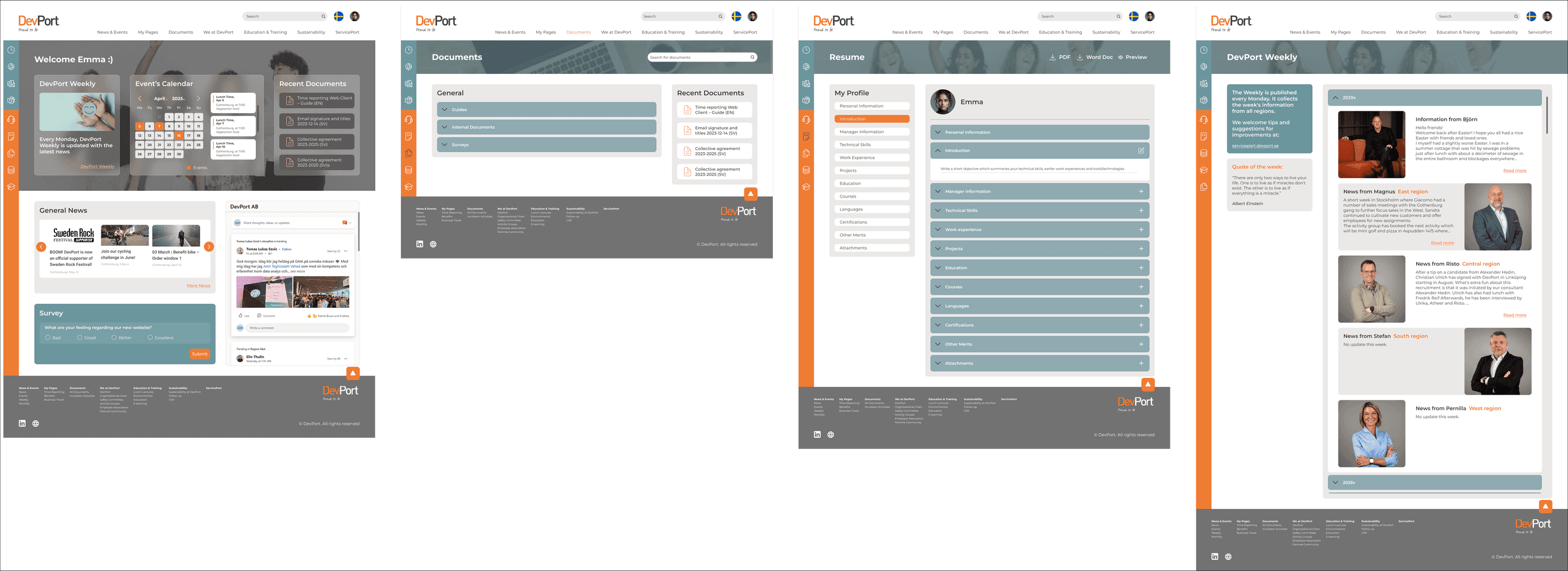
Every research finding, made concrete on the screen.
The high-fidelity design turned each finding into something specific: a better-labelled menu, quick links in the side bar for the resources consultants use daily, core content promoted according to the research, a modified sitemap in the footer, and direct access to external tools, time reporting, DevPortal, Outlook, Teams, from the homepage itself.
Usability testing
Task-based testing with six employees, followed by a structured survey.
We tested the redesigned intranet with task-based usability testing, follow-up questions and a post-test survey. Employees found navigation clear, documents easy to locate, and the new resume feature genuinely valuable. Feedback also surfaced the small refinements that matter, labels, icons and engagement tools.
- Agree
- Neutral
- Disagree
- 1 · Easy to navigate
- 2 · Info easy to find
- 3 · Logical layout
- 4 · Confident with navigation
- 5 · Clear landing overview
- 6 · Quick links intuitive
- 7 · Viva Engage useful
- 8 · Docs easy to locate
- 9 · Resume adds value
- 10 · Resume easy to fill
- 11 · Improved experience
- 12 · New features add value
- 13 · Comfortable using regularly
Navigation and document findability, the two failures that started the project, scored unanimous agreement. Quick links and Viva Engage were the weakest, and became the refinement list.
What testing found
Landing page
Clear layout and quick access were appreciated. Some confusion around the Event Calendar label and shortcut icons; branding and section labels suggested for improvement.
Document page
Documents were easily found and folder grouping read clearly, with minor naming adjustments suggested. Recent documents were useful but slightly redundant. Search worked well with minor confusion.
Resume page
Easy to view and update. 'Visualise' should be renamed 'Preview'. Layout tweaks proposed, move manager info, merge sections. Privacy controls and multiple versions requested. Rated positively for manager–employee collaboration.
Outcome
What it delivered
An IA validated against real tasks
All six testers agreed the redesign was easy to navigate and documents were easy to locate, the two failures that started the project.
The CV feature became collaborative
An interview insight (100% of participants wanted direct CV editing) turned into a redesigned feature that testers rated positively for manager–employee collaboration.
Scope tied to evidence, not opinion
MoSCoW prioritisation against survey data and internal usage statistics kept Documents, CV and Search at the top, and kept contested features like polls out of the must-have tier.
A refinement backlog, not just a design
Testing produced specific, actionable changes, label renames, icon clarity, privacy controls, version history, handed over as prioritised next steps rather than vague feedback.
Reflection
What I learned, and what I'd change
Cross-checking survey answers against the company's own usage statistics was the step that made everything else credible. When self-reported behaviour matched the logs, stakeholders stopped debating whether the research was representative and started discussing what to do about it.
What I'd change: I'd test the labels earlier and separately. Almost every piece of residual confusion in the final round came down to wording, Event Calendar, Visualise, folder names, and label testing is fast and cheap compared to re-testing whole flows.